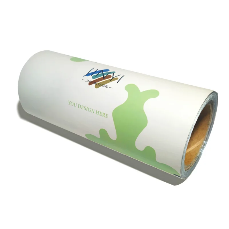
Rollos de alto rendimiento diseñados para una producción de envases rápida, uniforme y escalable.
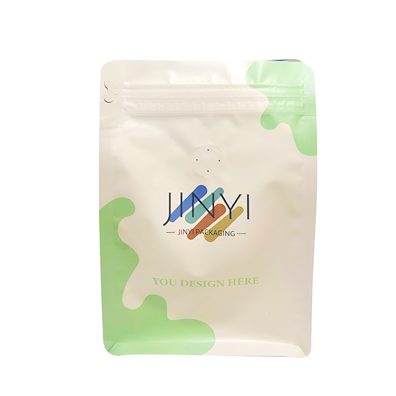
Bolsa de Mylar troquelada
Presencia de gran impacto en el lineal con una fuerte protección de barrera para mantener los productos frescos y listos para cumplir la normativa.
Bolsas planas
Un formato económico que ahorra espacio y ofrece un rendimiento de sellado fiable para el comercio minorista y los envíos cotidianos.
Bolsas con boquilla para líquidos
Envase fácil de verter y resistente a las fugas que mejora la comodidad del usuario y reduce el desorden en la entrega.
Embalaje de bolsas de almohada
Envasado ligero y rápido tipo bolsa, ideal para productos de gran volumen y marcas limpias.
Bolsa Quad Seal
Estabilidad similar a la de una caja con un atractivo de estantería superior: ideal para rellenos más pesados y un aspecto más “vertical”.
Bolsas con fuelle lateral
Bolsas de gran capacidad que ocupan poco espacio y maximizan el volumen de llenado manteniendo una forma limpia y estructurada.
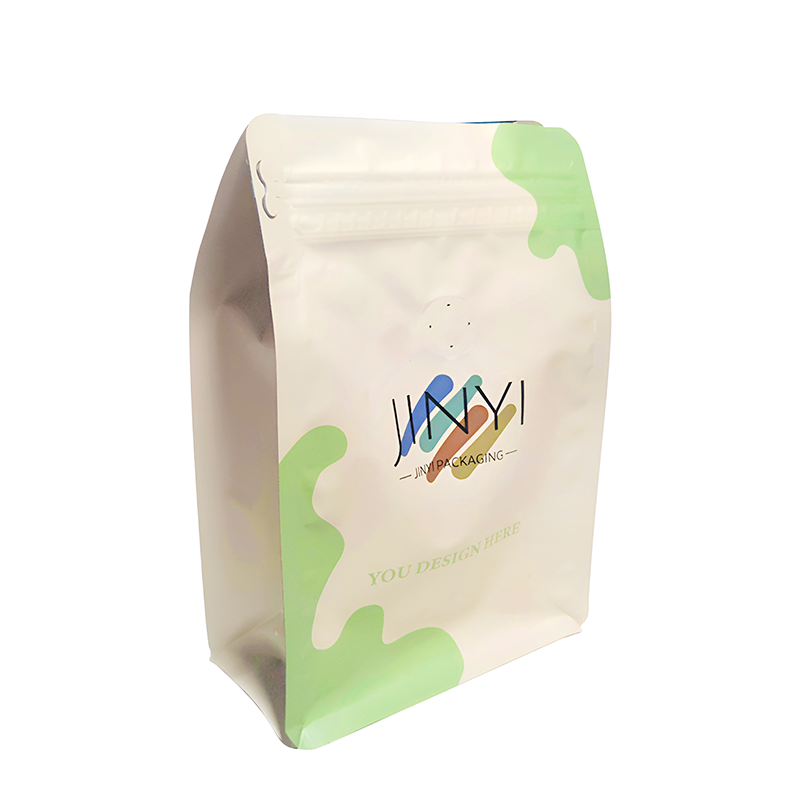
Fundas de pie
Uno de los formatos de más rápido crecimiento, que combina una gran exposición en el lineal, un menor coste de transporte y una gran protección de la frescura.
Bolsas de fondo plano
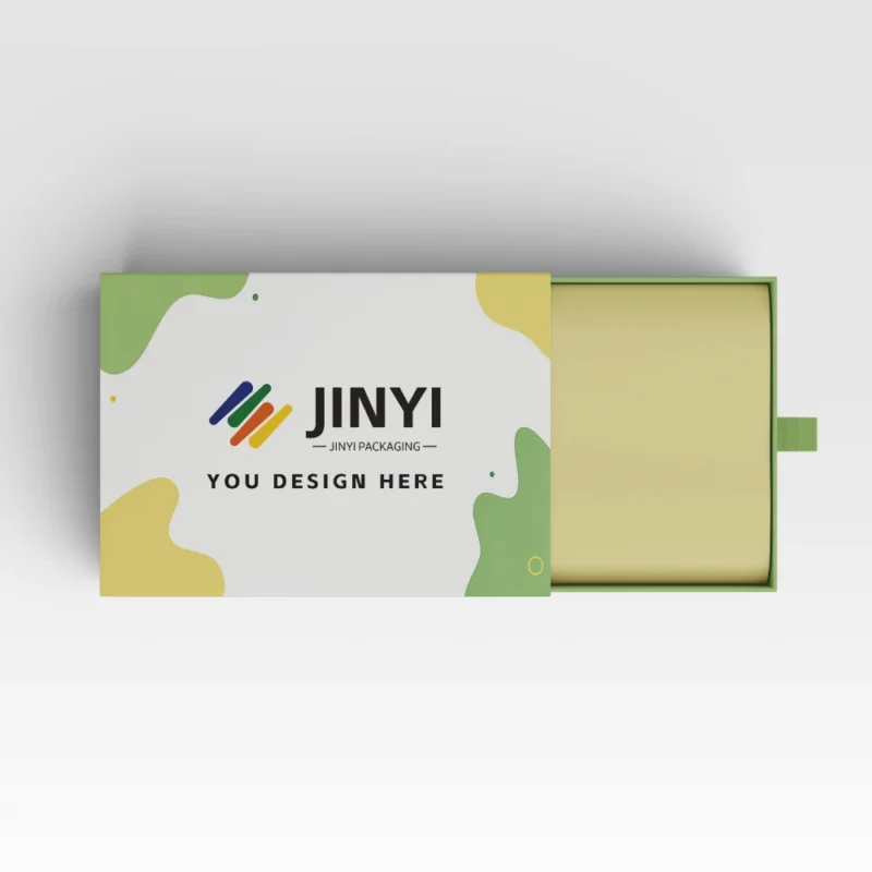
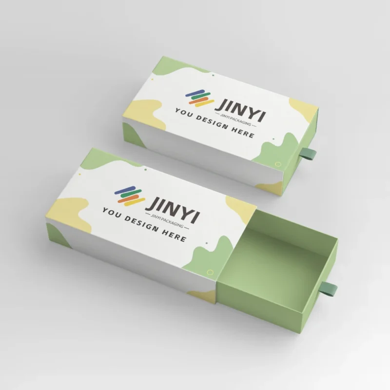
Joyero con cajón
Cajas de joyería con cajón para un desempaquetado de primera calidad y una protección rígida.
Joyero abatible
Joyeros abatibles de construcción rígida y presentación de lujo.
Estuche rígido retráctil de dos piezas
Cajas rígidas de dos piezas para una protección y presentación de lujo.
Buzones
Cajas de cartón ondulado para un envío seguro y un desempaquetado de marca.
Cajas de exposición
Cajas expositoras personalizadas para ventas en mostrador y gran visibilidad en los estantes.
Cajas de regalo
Cajas de regalo personalizadas con estructura y opciones de acabado de primera calidad.
Cajas de embalaje para mangas
Cajas con fundas y envoltorios impresos para una imagen de marca flexible.
Caja inferior con cierre automático
Cajas con fondo de cierre automático de montaje rápido para el comercio minorista y electrónico.
Caja de fondo de cerradura
Cajas con fondo de bloqueo para un embalaje rápido y un fuerte soporte de carga.
Cajas de cartón rectas
Cajas con extremos rectos para un cierre ordenado y una exposición al por menor.
Bolsa de papel personalizada
Bolsas de papel de regalo personalizadas con asas resistentes y una nítida impresión de marca.
Vasos de PET transparentes
Vasos de PET transparentes para bebidas heladas: cristalinos, resistentes y estancos.
Bolsa de regalo personalizada
Bolsas de papel de regalo personalizadas con asas resistentes y una nítida impresión de marca.
Vaso de papel
Vasos de papel para bebidas calientes con sujeción cómoda e impresión limpia y uniforme.
Bolsas planas para cannabis
Bolsas planas de cannabis con alta barrera y espacio libre para etiquetado.
Bolsas Mylar para malas hierbas
Bolsas de mylar para malas hierbas con barrera resistente, cremalleras y opciones de control de olores.
Cajas de hojalata personalizadas
Cajas de hojalata personalizadas para una mayor protección, reutilización e impresión a todo color.
Etiquetas retráctiles
Etiquetas de funda retráctil con cobertura de envoltura de 360° e impacto en el estante.
Etiquetas en rollo personalizadas
Etiquetas en rollo personalizadas para una aplicación rápida y un etiquetado de marca uniforme.
Adhesivo troquelado
Adhesivos troquelados con bordes limpios y opciones de materiales duraderos.
Hojas adhesivas Kiss Cut
Hojas de pegatinas cortadas a besos para facilitar el despegado y diseños flexibles.
JINYI comparte orientaciones prácticas de envasado para sus decisiones.
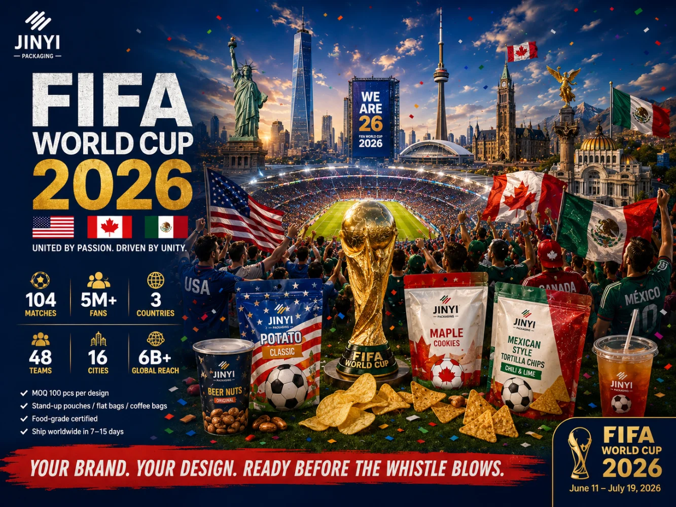
The 2026 FIFA World Cup is co-hosted by Mexico, the United States, and Canada — three countries with three distinct food cultures, three different regulatory environments, and three very different histories with flexible packaging. Mexico opens the tournament at Azteca Stadium on June 11. The US hosts the majority of matches across 11 cities. Canada contributes two host cities, Toronto and Vancouver. Together, they represent one of the most diverse consumer food markets on the planet — and one of the most instructive places to study how packaging strategy differs across cultures that share a continent but not a snacking vocabulary.
This article looks at the packaging decisions of seven food brands — two from Mexico, three from the US, and one from Canada that defines a category — and what those decisions reveal about each market’s packaging logic. The brands are not chosen because they are World Cup sponsors. They are chosen because they are representative: of the design systems their markets have developed, the film structures their product categories require, and the sustainability pressures their packaging supply chains are navigating. For a full breakdown of the World Cup’s food and beverage demand and the packaging opportunity it creates, the World Cup 2026 packaging demand overview covers the scale. For specific packaging ideas still available in the current tournament window, the World Cup packaging ideas guide covers the activation options.
Why the Three Host Nations Tell Three Different Packaging Stories
Flexible packaging in Mexico, the United States, and Canada shares a material foundation — multilayer laminate films, barrier coatings, heat-seal inner layers — but the design logic, regulatory context, and sustainability pressure that shape packaging decisions in each market are fundamentally different. Understanding those differences matters for any brand trying to enter one of these markets, and for any packaging buyer trying to understand why brands in each country make the choices they do.
Mexico is a market where packaging has to work hard at the point of purchase. The snack category is fiercely competitive at both the premium and value end, and packaging design has evolved to be maximally attention-grabbing — bold color fields, aggressive typography, flavor iconography that communicates heat level and intensity before the product name is read. The flexible packaging market in Mexico is dominated by PE, PP, and specialized EVOH multilayer structures, with solvent-free lamination increasingly standard in high-throughput snack plants. A notable trend: brand owners are rolling out 90-gram single-serve portion packs to meet commuter consumption patterns and calorie-control guidelines — which means smaller bags, more SKUs, and higher pressure on digital print economics.
The United States is the world’s largest flexible packaging market and the most format-diverse. The snack category ranges from commodity chips at mass-market price points to premium functional nutrition bars positioned as health infrastructure. The design language spans from maximally loud (Takis sells well in the US for a reason) to minimally restrained (RXBar’s ingredient-list-as-design approach works in a market sophisticated enough to read restraint as confidence). FDA compliance, English-language labeling, and shelf performance in large-format retailers like Walmart, Target, and Costco are the baseline requirements. Digital print short-run capability is increasingly used for market testing and limited edition activations — the US is one of the most active markets for HP Indigo flexible packaging production.
Canadá operates under the most aggressive sustainable packaging regulatory pressure of the three countries. The federal government’s 2022 ban on the import and manufacture of single-use plastics — including plastic cutlery, straws, and food service items made from hard-to-recycle plastics — has driven faster material transition in Canadian food service packaging than anywhere else in North America. English-French bilingual labeling is a mandatory requirement that adds complexity to every packaging brief. Consumer expectations around recyclability and environmental responsibility are measurably higher than in the US market. For a brand like Tim Hortons, operating 5,700 locations across Canada, the packaging compliance and sustainability mandate is not a marketing preference — it is a legal and operational requirement.
For brands entering these markets: The same flexible packaging format — a stand-up pouch in a PET/AL/PE laminate — requires different label content, different language requirements, and different sustainability documentation depending on whether it is entering Mexico, the US, or Canada. The physical bag can be identical. The compliance brief cannot.
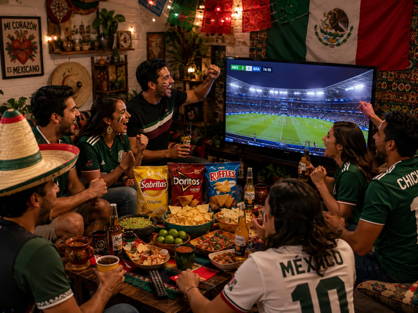
Mexico: Takis, Sabritas and the Packaging Logic Behind Latin America’s Boldest Snacks
Mexico’s snack category has produced two of the most visually aggressive packaging systems in the global food market — and both are now selling at scale in the United States, carried by the same Latin American diaspora communities that will make the World Cup’s host city atmosphere in Dallas, Los Angeles, and Houston feel more like Mexico City than any tournament outside of the Americas.
Takis. Takis was created in Mexico in 1999 by Barcel, a subsidiary of Grupo Bimbo — one of the world’s largest baking companies. The product entered the US market in 2006 and has since become one of the fastest-growing snack brands in North America, driven largely by social media virality and a packaging design system that communicates its identity before a consumer reads a word.
The Takis packaging system is built on color-as-flavor communication. Each variant uses a distinct, saturated hue that immediately signals its taste profile from a shelf or a screen: deep purple for the original Fuego, electric blue for Blue Heat, lime green for Nitro, bold red for Wild. The typography is jagged and aggressive — motion lines, explosion graphics, and flame motifs that communicate intensity before the flavor descriptor is processed. The result is a bag that communicates “extreme snack” in approximately 200 milliseconds of visual attention — the time a typical consumer spends glancing at a shelf before deciding whether to stop.
In 2021, Takis underwent a significant packaging redesign: a bigger emphasis on the Takis logo, the brand’s signature color taking center stage across all products, and a new “color blocking window” featuring a “flavor tornado effect” that showcases the product’s key ingredients. The redesign also introduced iconography identifying the spiciness level of each variant — a functional navigation element that helps consumers calibrate their heat tolerance before purchase. The format range spans from 1oz mini bags (individual vending and impulse) through 3.25oz standard bags, 9.9oz Party Size, and 17oz Fiesta Size — each format calibrated to a specific consumption occasion and retail channel.
The packaging material is a multilayer laminated film — the specific structure has not been formally published by Barcel, but the barrier requirement for a fried, seasoned rolled tortilla chip is well understood. The product contains oils from frying and seasoning blends with significant fat content, making oxygen barrier and grease resistance the primary film specification drivers. The estimated structure is an OPP/VMPET/PE or OPP/AL/PE laminate: an oriented polypropylene outer layer for print substrate and structural stiffness, a metallized PET or aluminum foil barrier layer for oxygen and moisture exclusion, and a PE inner heat-seal layer for food contact compliance. The pillow bag format — sealed on all four sides with a back fin seal — is appropriate for a lightweight, irregularly shaped snack at this fill weight range, and compatible with high-speed vertical form-fill-seal production at Barcel’s scale.
Sabritas. Sabritas was founded in Mexico City in 1943 as a local potato chip producer, acquired by PepsiCo in 1966, and has since become Mexico’s dominant snack food brand — a cultural fixture whose yellow packaging and recognizable mascot are as embedded in Mexican consumer identity as the products themselves. As a PepsiCo subsidiary, Sabritas is the umbrella brand for PepsiCo’s Mexico snack portfolio, which includes Ruffles, Doritos, Cheetos, Tostitos, and a range of uniquely Mexican flavor variants not available in the US market.
The Sabritas packaging system uses yellow as its foundational brand color — a warm, approachable palette that positions the brand as the everyday snack of Mexican households rather than an extreme or premium offering. The mascot, a smiling face associated with flavor satisfaction, appears consistently across SKUs in a way that maintains brand recognition across a large and varied product portfolio. The individual product variants — Sabritas Adobadas, Habanero, Limón, Crema y Especias — use color variations and flavor-specific graphics within the yellow brand framework to differentiate at the SKU level without fragmenting the overall brand identity.
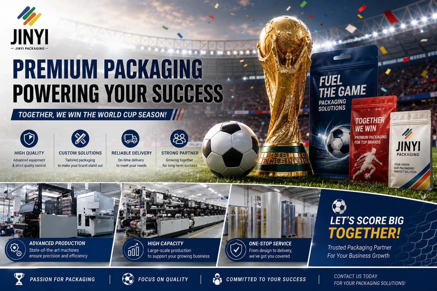
The most relevant Sabritas packaging story for the World Cup context is the football limited edition the brand has produced for the Mexican national team. The Sabritas design team created five limited-edition bags whose graphics, when arranged together, spell out “MEXICO” and “GOL” — with each bag featuring design elements inspired by the official uniform of the Mexico national team, including the texture of the kit and the colors of the Mexican flag. This is a direct illustration of the non-sponsor activation logic that works for packaging: no FIFA license required, no celebrity partnership needed — just five bags whose visual connection to Mexican football identity is immediate and culturally resonant. For brands planning similar activations, the format that enables this — a standard pillow bag with a large, continuous printable front panel — is exactly what JINYI’s custom stand-up pouch production supports in short-run digital print, from 500 units per design.
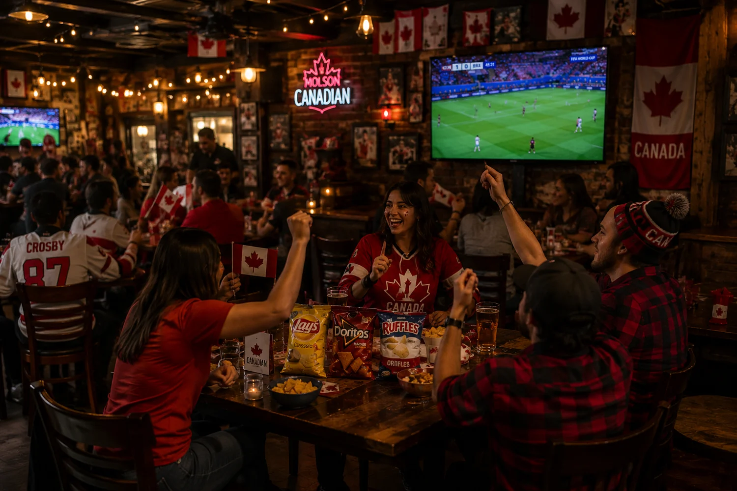
Canada: Tim Hortons and the Most Aggressive Sustainable Packaging Transition in North American Food Service
Tim Hortons was founded in Hamilton, Ontario in 1964 by ice hockey player Tim Horton and businessman Ron Joyce. It is now owned by Restaurant Brands International and operates more than 5,700 locations across Canada — a density that makes it arguably the most embedded food service brand in any North American market. The brand’s cultural significance in Canada is difficult to overstate: Tim Hortons is where Canadians get their morning coffee, their Timbits, their breakfast sandwiches, and their sense that the country is the same wherever they go.
What makes Tim Hortons packaging remarkable from a factory perspective is not the design — the cups and bags are straightforward food service formats — but the pace and scope of its sustainable packaging transition. Since 2020, Tim Hortons has been systematically eliminating single-use plastics from its packaging portfolio under its “Tims for Good” sustainability platform, driven in part by the Canadian federal government’s 2022 ban on the import and manufacture of hard-to-recycle single-use plastic items.
The scale of the transition is measurable. In 2023, Tim Hortons restaurants across Canada introduced wooden and fibre cutlery, eliminating an estimated 90 million single-use plastics annually. Plastic lids on Loaded Bowls were replaced with fibre lids. A redesigned breakfast and lunch wrapper was introduced that uses 75 percent less material than the previous wrap box — saving more than 1,400 tonnes of material per year. A 12-week trial of a plastic-free, recyclable fibre hot beverage lid ran in Vancouver; a second trial ran in Prince Edward Island in 2024. A hot beverage cup containing up to 30 percent post-consumer recycled content was tested in select Canadian restaurants.
The fiber-based hot beverage lid is a specific technical challenge that illustrates the engineering difficulty of sustainable packaging transitions in food service. A plastic lid on a hot beverage cup does four things: it seals the cup, it provides a drinking aperture, it insulates the hand from heat transmission, and it prevents spillage during movement. A fiber-based alternative needs to match all four functional requirements while being compostable or recyclable in standard municipal streams — a performance threshold that existing fiber lid technology has been approaching but has not fully matched at the quality level of a quick-service restaurant’s guest experience standard. Tim Hortons’ approach — running multiple pilots in different markets before committing to a national rollout — reflects the correct way to navigate a packaging material transition when the functional stakes are high.
For the takeaway bag format, Tim Hortons has replaced single-use plastic bags with reusable bags for purchase — a shift that eliminates one of the highest-volume single-use plastic touchpoints in its operation. The standard kraft paper takeaway bag, now used for food-to-go orders, is a format that combines high print surface area for brand and promotional messaging with fiber-based material that is compatible with most municipal recycling streams. For food service brands and restaurants in World Cup host cities looking to activate through custom takeaway packaging, the kraft paper bag is the format that combines the fastest production turnaround, the lowest minimum order quantity, and the most sustainable material credentials. JINYI’s custom kraft paper bags cover this format with custom print options and short-run digital production capability. For cold beverage formats, the clear PET cold cup line covers the transparency and clarity requirements of cold drink presentation in a food service context.
The broader lesson from Tim Hortons’ packaging journey is relevant for any brand operating in Canada or considering the Canadian market: sustainability is not a marketing preference in Canada — it is a regulatory baseline and a consumer expectation that is structurally higher than in the US market. A brand entering Canada with packaging that was designed to US standards will likely find that its recyclability claims, material specifications, and bilingual labeling do not meet Canadian market requirements without modification. For a comparable analysis of how sustainable packaging trade-offs work in the specialty coffee category, the breakdown of Stumptown’s PCR film upgrade covers the barrier-versus-recyclability trade-off in detail.
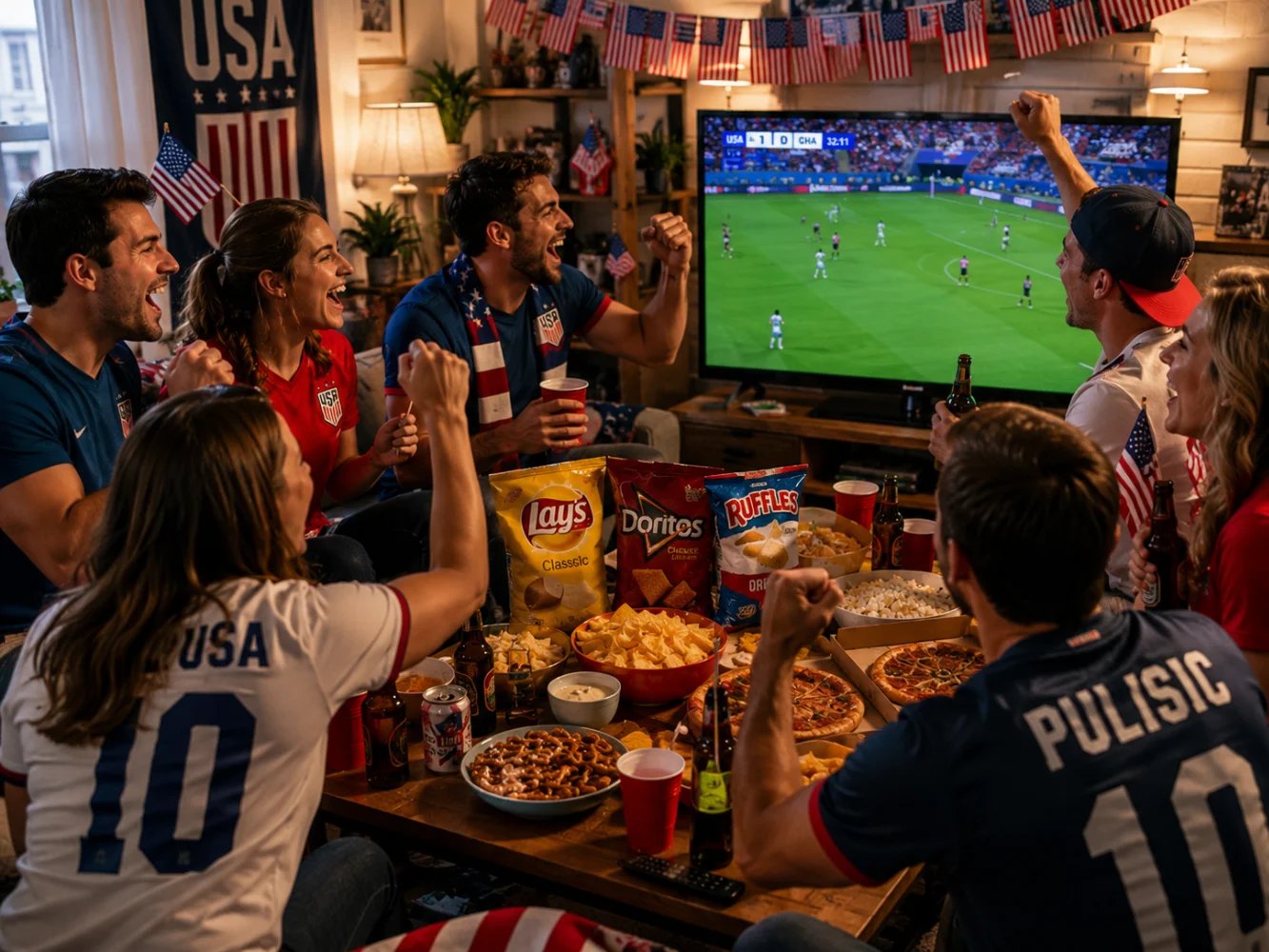
USA: Kind Bar, RXBar, Clif Bar and the Packaging Logic of American Functional Snacks
The US functional snack category — energy bars, protein bars, nutrition bars — is one of the most competitive shelf environments in American food retail. Every brand is fighting for the same 200 milliseconds of consumer attention, on shelves where 30 or more products in the same format compete simultaneously. The packaging decisions that differentiate these brands reveal a set of design strategies that are worth understanding independently of any World Cup context — and that become particularly relevant when the tournament brings an influx of international visitors to US retail environments where these brands dominate.
Kind Bar. Kind Bar is owned by Mars and sold across major US retailers including Target, Walmart, and Whole Foods. Its most distinctive packaging decision is the transparent window that runs across the front of the wrapper, allowing the consumer to see the actual product — whole nuts, seeds, and dried fruit — before purchase. This is a trust mechanism: in a category where “natural” and “whole ingredient” claims are common and frequently unverifiable on a closed package, the window makes the claim visually demonstrable. You can see the almond. You can see the dark chocolate. The product is the proof.
Kind Bar’s packaging material has been through a significant sustainability transition. The standard wrapper uses a PP-based multilayer film — oriented polypropylene with a metallized barrier layer, which is the industry standard for energy bar packaging providing adequate oxygen and moisture barrier at a relatively low material cost. In 2022-2023, Mars worked with SABIC and Landbell to introduce a film using certified circular polypropylene made from advanced recycling — a form of chemical recycling that converts end-of-life plastic into new PP rather than incinerating or landfilling it. The new film maintains the same barrier performance and printability as the standard film while incorporating recycled content that reduces virgin petroleum-derived plastic use. In 2025, Kind launched a more ambitious pilot: a curbside-recyclable paper wrapper, developed with Printpack and pre-qualified through How2Recycle, tested in 160 Whole Foods locations across eight US states. The paper wrapper represents a step toward primary packaging that is compatible with mainstream recycling — a significantly more difficult engineering challenge for a food product requiring moisture and oxygen barrier performance than it is for non-food packaging. The transparent product window that is central to Kind’s brand identity requires a clear film insert within the paper wrapper — a structural detail that adds production complexity but preserves the visual communication that defines the brand.
RXBar. RXBar was founded in Chicago in 2013 and acquired by Kellogg’s in 2017. Its packaging is one of the most frequently cited examples of design as brand philosophy in the US food industry — not because it is visually spectacular, but because it is built entirely around the brand’s “No B.S.” commitment to ingredient transparency.
The front of every RXBar wrapper lists only the main ingredients, in plain text, at maximum size: “3 EGG WHITES. 6 ALMONDS. 4 CASHEWS. 2 DATES. NO B.S.” There is no brand story, no health claim, no lifestyle imagery — just the ingredients, stated as facts. The design decision was made explicitly: “We’ve always been 100 percent committed to using only whole food ingredients. Up until now we listed those ingredients on the back of our wrappers like everybody else, like they’re a secret. But we’re not like everybody else. We don’t have secrets.” This is packaging as philosophy — the design communicates the brand’s values more directly than any tagline or imagery could.
The RXBar film structure is one of the rare cases in flexible packaging where the material specification is publicly documented. The wrapper is a two-layer adhesive lamination: 70-gauge matte OPP (oriented polypropylene) on the outside as the print substrate and structural layer, and 1.10-gauge metallized OPP on the inside as the barrier layer. The matte finish is functional as well as aesthetic — it reduces glare under retail lighting and provides the tactile quality that reads as premium on shelf. The metallized OPP inner layer provides adequate barrier for an energy bar with relatively low fat content and a standard retail shelf life of 12 months. The SKU color system — each flavor has a distinct background color, from vivid red to deep green to bright yellow — creates navigation across the portfolio within the minimal typographic framework.
Clif Bar. Clif Bar was founded in 1992 by Gary Erickson in California and acquired by Mondelez International in 2022 for $2.9 billion. It is the market leader in the US energy bar category and one of the most visually consistent packaging systems in American food retail. The wrapper’s iconic rock climber illustration — drawn on a napkin by artist Doug Gilmour — has appeared on every Clif Bar since the brand launched and has become one of the most recognizable images in the sports nutrition category.
The Clif Bar wrapper is a standard energy bar laminate: two layers of flexible polypropylene with aluminum foil sandwiched between them — PP/AL/PP or a variant thereof — providing the oxygen and moisture barrier required for a naturally produced organic energy bar with a shelf life of over 12 months. The aluminum foil center layer delivers near-zero OTR performance, which is appropriate for a product with organic fat content from ingredients like oats, nuts, and chocolate chips that would be susceptible to oxidative rancidity without adequate barrier protection. The wrapper is not recyclable in standard curbside streams due to its mixed-material construction — the same recyclability limitation that applies to most energy bar packaging across the category.
The three US brands illustrate three entirely different approaches to the same fundamental packaging challenge — a single-serve food product in a flow-wrap format on a competitive retail shelf. Kind Bar uses visual proof through a transparent window. RXBar uses ingredient-list-as-design to communicate transparency through typography. Clif Bar uses a consistent iconic illustration to communicate brand heritage and sports identity. All three use multilayer flexible film for barrier performance; none is currently recyclable through curbside programs. The comparison with the functional supplement category — where brands like Nutrición Bloom use social-media-driven color and AG1 uses premium zipper pouches — shows how the same US market produces radically different design strategies for products with similar barrier requirements. For the pillow bag and single-serve formats relevant to the energy bar and snack bar category, JINYI’s pillow bag production covers this format range in barrier laminate specifications.
Three Nations, Three Packaging Markets: What the Differences Mean for Brands Entering These Markets
The World Cup creates a temporary concentration of consumer attention across three markets simultaneously — but brands that want to convert that attention into lasting distribution need to understand the structural requirements of each market before they brief a factory.
Entering the Mexico market. Mexico’s NOM (Norma Oficial Mexicana) standards govern food packaging labeling, including the octagonal warning seals introduced in 2020 that must appear on products exceeding threshold levels of calories, saturated fat, sugar, sodium, and trans fat. These seals are not optional — they are mandatory on qualifying products and must be incorporated into the packaging design before production. Spanish-language labeling is required. The trend toward 90-gram portion packs means brands entering the Mexican market should evaluate whether their standard retail size aligns with local consumption patterns, or whether a market-specific format is warranted. Mexico’s US import growth — US consumer goods imports sourced from Mexico reached 15.8 percent in 2024 as brand owners nearshore from Asia — has created strong demand for bilingual artwork, FDA-compliant resin declarations, and color standards that match both market planogram requirements.
Entering the US market. FDA compliance and English-language labeling are the baseline. The US market’s format diversity means brands entering through DTC channels face different packaging requirements than brands entering through Walmart or Costco — the latter require specific shelf-ready packaging configurations, barcode placement standards, and pack dimensions compatible with their planogram systems. Digital print short-run capability is particularly valuable in the US market because it enables market testing — a brand can produce 500 units of a test SKU in a specific US regional market without committing to a full gravure print run. The US is also where limited-edition World Cup packaging has the broadest retail and DTC reach, given the size of the market and the diversity of the Latin American, European, and broader football-following consumer base.
Entering the Canadian market. Bilingual English-French labeling is a mandatory federal requirement for all food products sold in Canada — not a suggestion and not a regional requirement. Packaging that is not bilingual cannot be legally sold in Canadian retail. Beyond labeling, the single-use plastic ban has changed the material options available for certain packaging types: plastic cutlery, certain plastic food service items, and some single-use plastic bags are no longer permitted. PCR content, fiber-based alternatives, and recyclability claims carry more weight with Canadian consumers and retail buyers than in the US market. A brand that has invested in sustainable packaging for the US market — PCR film, recyclable structures, fiber-based formats — will find that investment more directly rewarded by Canadian consumers and retail partners than by their US equivalents.
Market
Label Requirement
Key Packaging Trend
Sustainability Pressure
Mexico
Spanish; NOM octagonal warning seals mandatory
90g portion packs; solvent-free lamination; nearshoring from Asia driving bilingual demand
Moderate; growing but not yet regulatory-driven
EE.UU.
English; FDA compliance; Nutrition Facts panel required
Format diversity; DTC growth; digital print short-run for market testing
Moderate; EPR legislation emerging in select states
Canadá
English + French bilingual mandatory; federal food labeling standards
Single-use plastic ban driving material transition; PCR content valued
High; federal legislation active; consumer expectations highest in North America
What Brands Building Packaging for These Three Markets Need from a Factory
The seven brands covered in this article — Takis, Sabritas, Tim Hortons, Kind Bar, RXBar, Clif Bar — represent packaging systems at very different stages of development, in very different categories, serving very different consumer bases. What they share is a set of factory requirements that any brand building flexible packaging for these markets will eventually face.
The first is barrier film documentation. Every market in this analysis requires the inner food-contact layer of flexible packaging to meet food safety standards — FDA 21 CFR in the US, COFEPRIS in Mexico, Health Canada standards in Canada. A factory that cannot produce food contact compliance certificates for the inner PE or PP layer of its laminates is not a viable production partner for any brand selling into regulated food markets. This documentation is a baseline requirement, not a premium service — and it should be requested and confirmed before production begins, not after.
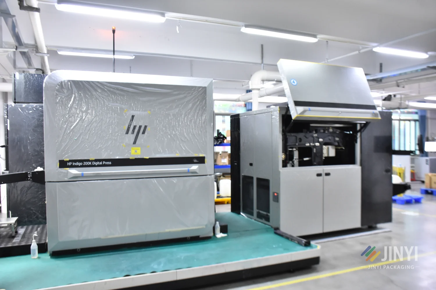
The second is multilingual label capability. A brand entering all three World Cup host nation markets needs English, Spanish, and French label content — across the same packaging format, produced from the same production run if possible. Digital print production allows different language versions to be produced in a single job with different file variants, eliminating the need for separate production runs for each market version. This is a specific capability of HP Indigo digital print that is not available in traditional gravure or flexographic production, where different label versions require different printing plates or cylinders.
HP Indigo 200K - La prensa más reciente de JINYI, puesta en servicio en 2025, amplía la capacidad de impresión digital y reduce los plazos de entrega
The third is design system consistency. Takis’s color-coded flavor system, Sabritas’s yellow brand framework, RXBar’s ingredient-list typography, Kind Bar’s transparent window — all of these are design systems that depend on consistent reproduction across production runs and across market variants. A color that drifts between the Mexican market version and the US market version of the same product is a brand integrity failure. Color management to defined LAB values with Delta E tolerances, confirmed on physical pre-production samples, is the production discipline that prevents this.
JINYI produce bolsas autoportantes, bolsas tipo almohadilla y formatos en barritas, side gusset bags, y flat-bottom bags in barrier laminate specifications appropriate for snack food, functional nutrition, and food service packaging — with food contact compliance documentation, color-managed HP Indigo digital print from 500 units, and physical pre-production samples as standard. For brands entering the World Cup host nation markets and needing packaging that meets the regulatory, design, and sustainability requirements of each, the conversation starts with which market you are entering and what your product’s barrier requirements are. The guía para la producción de bolsas a medida covers each stage of the factory process before the first conversation.
Building Packaging for Mexico, the US or Canada?
JINYI produces custom flexible packaging in barrier laminate specifications for snack food, functional nutrition, and food service brands — with food contact compliance documentation, multilingual label capability, color-managed digital print from 500 units, and physical pre-production samples as standard. Whether you are entering one of the three World Cup host markets or all three, the brief starts with the market requirements, not the design file.
JINYI es una fábrica de origen de envases flexibles personalizados con más de 15 años de experiencia en producción, que sirve a marcas de alimentación, suplementos, café, alimentos para mascotas y bienes de consumo en más de 150 países. Producimos bolsas stand-up, bolsas de fondo plano, bolsas almohada y bolsas con fuelle lateral en PET/AL/PE, PET/VMPET/PE y otras especificaciones de barrera, mediante impresión digital HP Indigo a partir de 500 unidades e impresión en huecograbado por volumen, con documentación completa del material incluida de serie con cada pedido.
Eso es lo que De la película al acabado: bien hecho significa en la práctica.
Elsa
Director de Desarrollo Comercial - JINYI Packaging
Elsa dirige el desarrollo empresarial y la gestión de pedidos de clientes en JINYI. Con 8 años de experiencia en comercio exterior en Yiwu y Dongguan, conoce a la perfección la demanda del mercado y las necesidades reales de los compradores.
Necesidades del cliente Gestión de pedidos Desarrollo empresarial
What packaging material does Takis use for its snack bags?
Barcel has not published an official film specification for Takis packaging. Based on the product’s high fat content from frying and seasoning, and the barrier requirements for a fried snack with a standard retail shelf life, the estimated structure is a multilayer laminate — most likely OPP/VMPET/PE or OPP/AL/PE. The outer OPP layer provides the print substrate for Takis’s high-saturation color graphics and structural stiffness for the pillow bag format. The metallized PET or aluminum foil middle layer provides oxygen and moisture barrier. The inner PE layer provides food contact compliance and heat-seal performance on the bag’s fin seal and end seals.
What film structure does RXBar use for its protein bar wrapper?
RXBar’s film structure is one of the rare cases in flexible packaging where the specification is publicly documented. The wrapper is a two-layer adhesive lamination: 70-gauge matte OPP on the outside as the print substrate, and 1.10-gauge metallized OPP on the inside as the barrier layer. The matte OPP outer layer provides both the aesthetic finish (matte premium feel) and the structural support for flow-wrap production. The metallized OPP inner layer provides adequate oxygen and moisture barrier for a whole-food energy bar with a 12-month shelf life at standard retail storage conditions.
What sustainable packaging changes has Tim Hortons made?
Tim Hortons has made several documented packaging transitions since 2020 under its “Tims for Good” platform. In 2023, the chain eliminated an estimated 90 million single-use plastics annually by introducing wooden and fibre cutlery across its 5,700+ Canadian locations. A redesigned breakfast and lunch wrapper reduced material usage by 75 percent, saving more than 1,400 tonnes of material per year. A fibre-based hot beverage lid was trialed in Vancouver and Prince Edward Island. A paper cup with up to 30 percent post-consumer recycled content was tested in select restaurants. These changes were driven partly by the Canadian federal government’s 2022 ban on certain single-use plastic items.
Why does Kind Bar have a transparent window on its packaging?
Kind Bar’s transparent window allows consumers to see the actual product — whole nuts, seeds, and dried fruit — before purchase. In a category where “natural” and “whole ingredient” claims are common and frequently unverifiable on a closed package, the window makes the claim visually demonstrable. The design decision functions as a trust mechanism: the product itself is the proof of the ingredient quality claim. This is the same logic behind ZIWI Peak’s small window on its air-dried pet food pouch — in both cases, showing the product is more credible than claiming it.
What packaging requirements are different between Mexico, the US, and Canada?
Mexico requires Spanish-language labeling and mandatory NOM octagonal warning seals on products exceeding threshold levels of calories, fat, sugar, and sodium. The US requires English-language labeling, FDA compliance, and a Nutrition Facts panel per FDA standards. Canada requires bilingual English-French labeling as a federal mandatory requirement, and the 2022 single-use plastics ban restricts certain packaging material types. All three markets require food contact compliance documentation for the inner layer of flexible packaging, but the specific regulatory frameworks differ. A brand entering all three markets needs packaging that meets all three sets of requirements simultaneously or in market-specific versions.
What did Sabritas do for the Mexico national football team?
The Sabritas design team created five limited-edition packaging designs to celebrate the Mexico national football team. The five bags, when arranged together, spell out “MEXICO” and “GOL.” Each bag features design elements inspired by the official Mexico national team kit, including the texture of the uniform and the colors of the Mexican flag. The activation required no FIFA licensing — the national team identity and flag colors are not FIFA intellectual property. It demonstrates how food brands can create culturally resonant football packaging through design and concept rather than official sponsorship agreements.
What is the minimum order for custom snack packaging for these markets?
At JINYI, custom flexible packaging via HP Indigo digital print is available from 500 units. For brands testing a new market — Mexico, the US, or Canada — a 500-unit run allows physical product in market without committing to gravure printing minimums of tens of thousands of units. Multiple language variants can be produced in a single digital print job at different quantities, which is particularly useful for a brand producing English, Spanish, and French versions of the same packaging for three different market entries simultaneously.