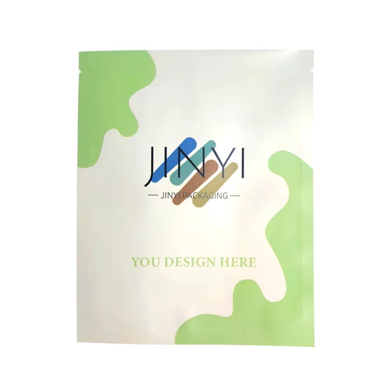
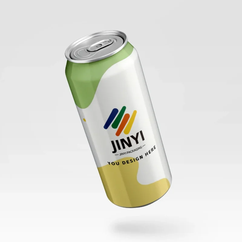
Problem: Compliance rules can hijack your design. Agitation: One label mistake can trigger holds, delistings, and refunds. Solution: I build compliance into structure, layout, and production from day one.
I meet cannabis packaging compliance by treating the pack as a system: I lock must-have warnings, traceability, barcode zones, and CR/tamper needs first, then I choose materials, barrier, and finishes that stay readable, consistent, and durable in real retail and delivery.
I never treat compliance as a sticker I add at the end. I treat compliance as part of the packaging architecture. When I build the layout, I also build the structure, the sealing logic, the production tolerances, and the test plan. That approach protects my brand and reduces rework.

Why must compliance and branding be designed together?
Problem: Teams design first and “fix compliance later.” Agitation: Late fixes destroy hierarchy and create costly reprints. Solution: I design brand cues around locked compliance zones from the start.
Compliance is not a last-minute label. It changes how the pack opens, how panels read, and where critical text can live. In the U.S. and EU, audits, platform checks, and return systems amplify small mistakes. I start by locking the non-negotiables: warnings, required disclosures, batch/traceability, and scannable barcodes. Then I design the brand message around those constraints. I also plan how customers handle the pack. I ask where fingers touch, where scuffs happen, and where folds crack. I keep compliance text away from abrasion zones and away from folds that distort type. I also keep my front panel clean with a strict hierarchy. I limit the front to what the shopper needs in three seconds. I push dense legal text to side or back panels that stay flat and readable. This approach keeps the brand clear and keeps the compliance team calm. I treat both as one system, not two separate jobs.
What I lock before I polish design
| Element |
Why it matters |
Common failure |
My fix |
| Warnings |
Legal requirement |
Too small or low contrast |
Set minimum size + contrast rules |
| Barcode zone |
Retail scanning |
Placed on folds or glossy glare |
Reserve flat, matte-friendly zone |
| Traceability |
Recalls & audits |
Variable data has no space |
Build a variable-info box early |
| Opening logic |
Safety + UX |
CR breaks usability |
Prototype with real users |
Which market and channel realities should I decide first?
Problem: Brands assume one pack works everywhere. Agitation: State-by-state rules and channel stress expose weak assumptions. Solution: I define destination rules and route stress before I choose structure.
I begin with “where will this product actually live.” The U.S. market often changes requirements by state, and platforms and retailers add their own constraints. The EU market often pushes harder on claim boundaries, language clarity, and label readability. I do not guess. I define the target regions, the sales channels, and the route. I ask whether the pack sits on a shelf, rides in delivery, or ships through parcel networks. I also ask who handles it. I plan for store staff, delivery drivers, and consumers. Each step adds compression, vibration, and abrasion. Those forces can turn small design issues into compliance issues. A fold can cover a warning. A scuff can remove a batch code. A lid or zipper area can distort a panel. I also plan for temperature swings and humidity changes during storage. Those changes can affect adhesives, seals, and label integrity. When I map these realities first, I can set realistic material and finish choices. I can also avoid launch delays caused by “surprise requirements” from a retailer or an enforcement review.
How channel changes the compliance risk
| Channel |
What breaks first |
What gets flagged |
My control |
| Retail |
Scuff + glare |
Unreadable warnings |
Durable coat + high contrast |
| Delivery |
Compression + leaks |
Tamper concerns |
Stronger structure + seal checks |
| E-commerce |
Drops + friction |
Damaged labeling |
ISTA-style route testing |
| Cross-border |
Language + claims |
Misleading statements |
Pre-approved claim library |
What compliance building blocks must be right before anything else?
Problem: Teams treat required text as “extra content.” Agitation: Text lands on folds, glue areas, or zipper profiles and becomes unusable. Solution: I build a label architecture with fixed zones and tolerances.
I treat compliance as an information layout problem. I separate “must-have” from “nice-to-have.” I lock the must-have items in fixed zones: warnings, ingredients or key disclosures, net content, batch and traceability, and barcodes that scan in real stores. I reserve a clean variable-data box for dates, batch codes, and SKU shifts. I never place critical text on folds, glue seams, zipper rails, or tear features. Those areas move, wrinkle, or distort. I also plan for manufacturing tolerances. I assume cutting and sealing will drift slightly, so I build safe margins. I also plan how a customer reads the pack. I keep the front panel minimal and fast. I move dense legal copy to side and back panels that stay flatter. I also protect readability under store lighting. I avoid low contrast and avoid high glare finishes near compliance text. This approach keeps the brand face clean and keeps the compliance text stable. It also reduces rework because my layout does not collapse when someone adds one more required line.
My label architecture rules
| Zone |
Purpose |
Do |
Don’t |
| Front panel |
3-second decision |
Brand + category + one key cue |
Overload with legal paragraphs |
| Side/back panel |
Compliance density |
Warnings + instructions + disclosures |
Put on gusset folds |
| Barcode area |
Scan success |
Flat zone + controlled gloss |
Place on seam or curve |
| Variable data box |
Traceability |
Reserved space + clear contrast |
Let it float near artwork edges |
How do I meet child-resistant and tamper-evident needs without ruining experience?
Problem: CR and tamper features can feel bulky and frustrating. Agitation: Bad usability becomes bad reviews and repeat handling errors. Solution: I choose safety features that match the product and the user flow.
I treat CR and tamper evidence as part of the user journey. I start by defining the product form and the expected opening frequency. Flower and pre-rolls often require repeated open-close cycles, so I prioritize reliable reclosure after the first open. Edibles may need portion control and stronger protection against accidental access. Concentrates may need better chemical resistance and tighter closure performance. I avoid “one CR design for everything.” I also plan tamper evidence so consumers understand it instantly. If the consumer cannot tell whether the pack was opened, the brand loses trust even if it is technically compliant. I check how the feature affects sealing windows, tear behavior, and production yield. A complex feature can lower yield and create variability, and variability is a compliance risk. I prototype early and I test with real hands. I also test after compression and temperature swings. If the pack becomes hard to open after shipping, consumers will force it and tear through critical text. I want safety to be real, but I also want it to be practical.

CR and tamper decisions I make by use case
| Need |
What it protects |
Risk |
My control |
| Child-resistant |
Accidental access |
Poor usability |
Prototype + user handling checks |
| Tamper-evident |
Trust at first open |
False “opened” look |
Clear break point + consistent tear |
| Reclosure |
Repeat freshness |
Odor leaks at zipper |
Zipper compatibility + leak paths test |
| Yield stability |
Mass production |
Variation in features |
Process limits + QC checkpoints |
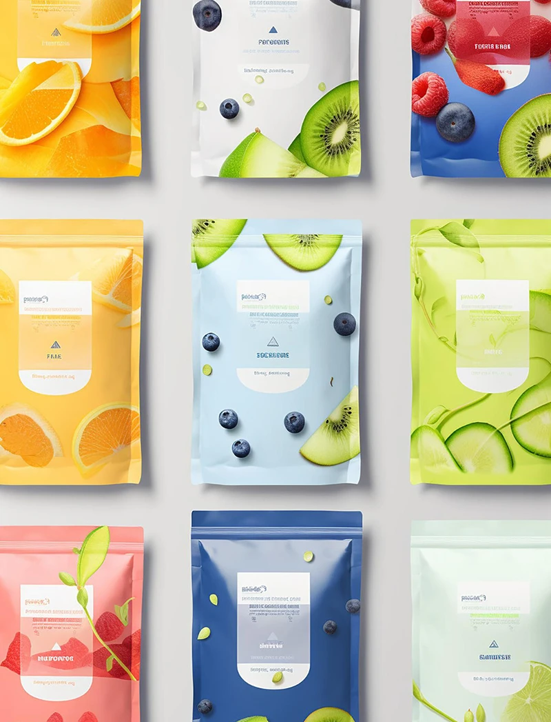
How do material, barrier, printing, and finishes affect compliance in the real world?
Problem: Teams chase premium looks or sustainability claims first. Agitation: Glare, scuffs, and batch shifts make required text unreadable and create complaints. Solution: I choose materials and finishes that protect readability and consistency.
I choose surfaces that stay readable after handling. Matte, gloss, soft touch, and foil can all work, but each one changes glare, scuff visibility, and color perception. I do not use premium effects that reduce contrast on compliance text. I also avoid tiny type on reflective or textured areas. I plan for batch consistency because warning colors and legal layouts cannot drift. I also treat barrier and freshness as part of compliance because odor complaints and stale product complaints can trigger returns and scrutiny. I choose barrier structures based on the product risk and the shelf-life goal. I do not trust material names alone. I validate by looking at real performance targets and real leak paths. I also manage inks and adhesives because odor and migration concerns can become a compliance problem depending on the category and channel. If a pack smells like ink, the customer will call it unsafe even when the product is fine. I make sure my surface choice supports both the brand feel and the operational reality. My goal is simple: the pack must look legal, feel trustworthy, and survive the route.
Finish and material choices that protect compliance
| Choice |
Upside |
Compliance risk |
My fix |
| High gloss |
Strong shelf pop |
Glare on warnings/barcodes |
Matte islands for text zones |
| Soft touch |
Premium hand feel |
Scuff/whitening and fingerprints |
Durability testing + coat tuning |
| Foil accents |
Clear hierarchy cues |
Reflective interference with text |
Keep foil away from legal copy |
| High barrier films |
Odor + freshness control |
Flex-crack at folds |
Fold-zone design + route testing |
Which production controls and real-world tests prevent compliance surprises?
Problem: Samples pass, mass production drifts, and the route exposes weaknesses. Agitation: A small drift can push text out of safe zones and trigger reprints. Solution: I standardize specs, test the route, and lock QC checkpoints.
I design for manufacturing, not for perfect artwork screens. I assume registration drift and cutting tolerance. I build safe zones around all required text. I avoid hairline strokes in critical compliance areas. I also avoid placing barcodes near seams, zippers, and tear features because those areas move. I set production checkpoints that match the failure modes: readability under light, barcode scan success, abrasion resistance, and variable-data legibility after handling. I also test in conditions that predict complaints.Alignment checks matter, but route behavior matters more. I run compression, drop, vibration, and temperature-humidity cycles because delivery and storage create stress that lab checks miss. I also test closure performance, especially for packs that need reclosure. When I shortlist 2–3 options, I always provide trade-offs and a validation checklist. I keep the “basic compliance” option stable and scalable. I keep the “brand upgrade” option safe by protecting text zones. I keep the “flagship” option disciplined by limiting effects to anchors and hierarchy cues. This system makes compliance achievable without killing the brand voice.
My prevention checklist
| Control |
What it prevents |
How I verify |
When |
| Safe zones + tolerances |
Text cut-off |
Dieline proof + press checks |
Before sampling |
| Scan testing |
Barcode failures |
Real scanner + phone camera |
Sample + pilot run |
| Abrasion testing |
Unreadable warnings |
Rub/scuff simulation |
Sample stage |
| Route simulation |
Delivery damage |
Drop + compression + climate |
Before mass production |
Conclusion
I lock compliance zones first, then I build brand hierarchy around them. I validate with real route tests, and I standardize specs so every batch stays readable and defensible.
FAQ
- Why does compliance “ruin” my design?
Compliance ruins design when teams add required text late and do not reserve fixed zones, margins, and tolerances from the start.
- What causes barcode scan failures on flexible packs?
Most failures come from placement on folds, seams, glare-heavy finishes, low contrast, or distortion near zippers and tear features.
- Is child-resistant packaging always harder to use?
It does not have to be. Good CR design matches the product form and the opening frequency, and it is tested after shipping stress.
- Can I use premium finishes and still stay compliant?
Yes. I keep premium effects away from legal copy, and I protect readability with controlled glare zones and durability testing.
- What is the fastest way to choose a safe packaging direction?
I shortlist 2–3 options using three inputs: must-have compliance items, channel stress, and shelf-life or odor risks, then I validate with a clear test plan.
About Jinyi
Brand: Jinyi
Tagline: From Film to Finished—Done Right.
Site: https://jinyipackage.com/
I run a packaging factory team focused on flexible packaging solutions. I build systems that reduce communication cost and improve batch consistency. I care most about controllability, stable lead times, and repeatable quality.
About the User Persona (Quillon)
Quillon is a packaging and production leader with strong engineering and supply chain experience. Quillon values clarity, traceability, stable specs, and reliable mass production. Quillon prefers measurable parameters, clear checkpoints, and practical validation methods.