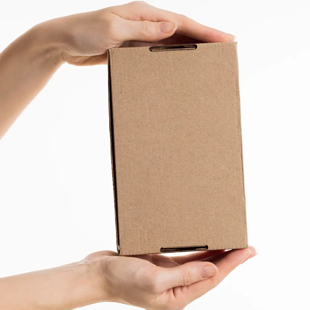
Your box can look premium online, then arrive crushed. When that happens, the product still works, but the brand trust breaks.
I choose the right custom paper box by treating it as a system: product protection, shelf impact, and production reality must match. I start from product risk and channel stress, then I lock material, structure, and finishes that can scale without surprises.

I do not ask a brand how “high-end” they want the box to look. I ask how well the product must be protected. Then I work backward to the board, the dieline, and the finishing choices that stay stable in mass production.
Why is “the right box” a system, not just a look?
A box can win attention and still fail in shipping. That is the most expensive type of packaging mistake.
The same artwork can feel premium or cheap depending on board, structure, and finishing. In the U.S. and EU, higher channel expectations make weak boxes costly because returns, rework, and bad reviews happen fast.
I treat custom paper boxes as a linked system. Material decides stiffness and print behavior. Structure decides crush resistance and assembly speed. Finishes decide readability, scuff resistance, and the “in-hand” feeling. If one part is wrong, the rest cannot save it. Many teams choose finishes first because they are visible. I choose protection and manufacturability first because they determine whether the finish survives real handling. My decision flow is product → channel → experience → budget, not the other way around.
What changes when you change one “box input”
| What you change |
What it affects |
Common failure if ignored |
| Paperboard type |
Whiteness, print, stiffness |
Color looks dull or structure collapses |
| Structure and closure |
Protection, assembly, unboxing |
Crushed corners or slow packing |
| Finish effects |
Feel, glare, scuff, premium cues |
Scuffing, fingerprints, unreadable text |
How do I start from the product (weight, fragility, and use)?
Many box failures happen because teams design for the shelf, not for the product’s weak points.
I match the box to product weight, sharp edges, fragility, and how often it will be opened. This decides board strength, closure style, and whether an insert is needed.
I ask simple questions first. Is the product heavy, fragile, or oddly shaped? Does it have sharp corners that can puncture the box? Will it be opened once, or opened many times as a storage box? These answers decide whether we need a stronger board, a more protective structure, or inserts and partitions. Inserts can reduce damage and improve perceived quality, but they also add cost and assembly time. In developed markets, damage is not only a cost issue. It is a trust issue. A premium product in a crushed box looks like a fake. That is why I prioritize protection requirements before I talk about coatings or foil.
Product questions that decide the box quickly
| Product trait |
Typical risk |
Box decision |
| Heavy or dense |
Bottom failure, corner crush |
Stronger board + stronger base structure |
| Fragile or glass |
Impact damage |
Insert/partition + tighter fit |
| Sharp edges |
Inner abrasion, puncture |
Reinforced panels + insert protection |
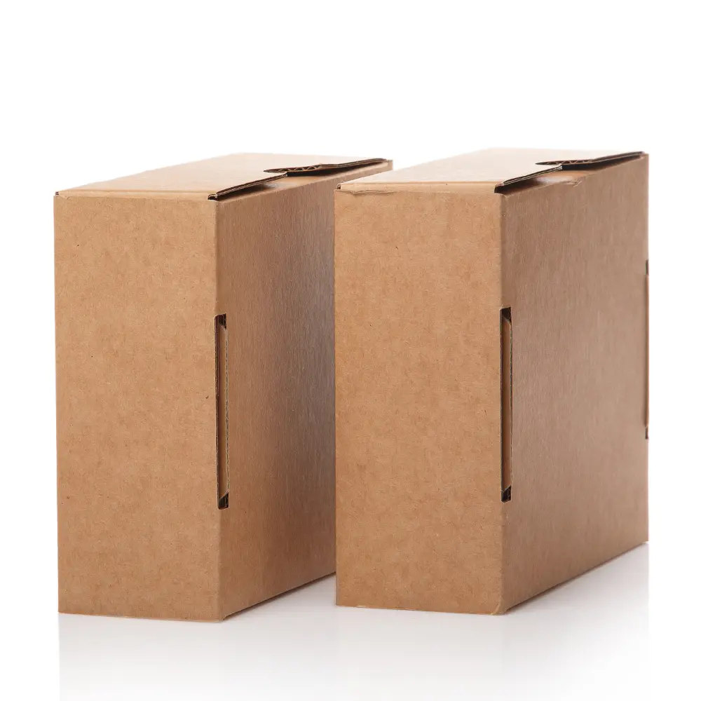
Which paperboard should I choose (SBS, kraft, CCNB, coated vs uncoated)?
Many brands think “whiter is better.” That is not always true.
SBS, kraft, and CCNB each have a ceiling. The right one depends on your brand style, print needs, and protection target.
SBS is the clean, bright choice with strong print performance. It fits premium cosmetics and many food categories where color accuracy matters. Kraft has a natural look and strong “eco” cues. It fits outdoor brands and minimal designs, but it can limit color saturation and fine detail. CCNB or duplex board is cost-friendly for mass retail, but it has a limit in premium feel and surface perfection. Coated vs uncoated matters too. Coatings usually improve ink holdout and sharpness, while uncoated surfaces feel more organic but can absorb ink and dull colors. I do not treat these as “better or worse.” I treat them as trade-offs that must match the product and channel reality.
Quick board guide: where each one wins
| Board |
Best for |
Watch-out |
| SBS |
Premium print and clean color |
May not fit “natural” brand positioning |
| Kraft |
Natural look and tactile cues |
Colors can look muted without design control |
| CCNB / Duplex |
Value retail and high volume |
Premium finishes may expose surface limits |
How do I choose thickness and strength without overpaying?
A box can feel hard in hand and still fail after shipping compression.
Strength is not only thickness. Caliper, folding behavior, and structure geometry decide crush resistance and corner integrity.
I see a common mistake: teams reduce board weight to save cost, then the box collapses, corners burst, or glue joints open. Another mistake is the opposite: teams overbuild thickness without fixing the weak structural points. A well-designed structure on the correct board often beats a thick board with weak geometry. I consider product weight, stack pressure in cartons, and channel stress. For e-commerce, compression and drops matter more. For retail, shelf handling and constant touch matter more. I also check fold lines because some boards crack or whiten at folds if not processed correctly. I treat strength as a real protection requirement, not as a “feel” requirement.
Where strength usually fails first
| Failure |
Typical cause |
What I change |
| Corner crush |
Weak geometry or low board stiffness |
Board upgrade or structure reinforcement |
| Box collapse |
Bottom not designed for load |
Stronger bottom style or insert support |
| Fold cracking |
Incorrect scoring or coating mismatch |
Score tuning and material testing |
Which box structure should I use (styles, closures, and inserts)?
Structure decisions are usually the fastest way to reduce damage and improve unboxing.
I choose the structure by your channel and your packing process. The best-looking closure is not always the best-performing closure.
Folding cartons come in many forms: straight tuck end, reverse tuck end, auto-lock bottom, and mailer-style structures. Each style changes protection and assembly speed. Inserts also matter. Paper inserts can be more brand-friendly. Plastic inserts can hold shape well. EVA can feel premium but affects sustainability positioning. Corrugated dividers can be very effective for shipping, but they may add bulk. I avoid choosing structure from a template library alone. I match it to product fit, packing speed, and the channel’s handling intensity. A box that is hard to assemble causes real operational cost. A box that looks great but opens easily in transit causes returns.
Structure choices that change both cost and experience
| Option |
Why brands choose it |
Trade-off |
| Straight / Reverse tuck |
Clean look and efficient production |
Protection depends on board and fit |
| Auto-lock bottom |
Stronger base for heavier products |
Higher cost and more complex dieline |
| Mailer-style |
Good for e-commerce unboxing |
Needs careful scoring for repeat opening |
How do I pick printing and finishes that add value (without stacking effects)?
Many boxes look amazing in a sample, then look inconsistent in mass production.
Finishes should create hierarchy, not decoration. I use matte, gloss, soft touch, spot UV, foil, and embossing as “anchors,” not as full-coverage noise.
I start with printing method basics. Offset printing is stable for mid to large runs and gives strong detail. Digital printing is flexible for low MOQs and multiple versions. Then I choose finishes based on what the customer must notice first. Matte can feel premium and reduce glare, but it can also make dark colors look flat if design is not controlled. Gloss can boost saturation, but glare can hurt readability. Soft touch can feel high-end, but it needs scuff and fingerprint management. Spot UV and foil work best as a focal point, not as a full-coverage layer. Emboss and deboss can add depth, but they need clean artwork and realistic line thickness. I always consider registration tolerance and yield impact, because those decide whether the “premium look” stays consistent across batches.
Finish effects: what they really do in the real world
| Finish |
Best use |
Common risk |
| Matte |
Premium feel and better readability |
Dark colors can look dull if not designed well |
| Soft touch |
“Premium in hand” cue |
Scuffing and fingerprints if not managed |
| Foil / Spot UV |
Focal point and hierarchy |
Registration limits and overuse looks cheap |
How do I design for manufacturing (dielines, tolerances, barcodes, and assembly)?
Many premium designs fail because the dieline reality was ignored.
Manufacturing details decide yield, lead time, and the final look. If tolerances are not planned, finishes and text placement will “drift” in production.
I treat dielines as production documents, not as design files. Bleed and safe zones protect your design from cutting drift. Barcode zones must stay away from folds, glue seams, and curves to avoid scan issues. Foil and spot UV need realistic line thickness and spacing, or they fill in and lose clarity. Small text near score lines can warp after folding. These are not rare issues. They are common when brands design for a flat PDF, not for a folded box. I reduce this risk by reviewing the dieline early, locking the critical zones, then approving sample results for feel, readability, and scuff resistance before mass production.
Design zones I always protect
| Zone |
Why it matters |
Rule I follow |
| Glue seam area |
Ink and finishes can fail |
Keep key graphics away from it |
| Fold/score lines |
Cracking and distortion |
Avoid fine text and foil across folds |
| Barcode panel |
Scan reliability |
Flat, clean, and high-contrast area |
How do I balance look, budget, and lead time without guessing?
Most cost surprises come from stacking “small upgrades” without a plan.
Cost is driven by size, board, color count, finishing steps, structure complexity, and inserts. Lead time is driven by sampling rounds, finishing combinations, and die-cut scheduling.
I keep decisions simple. I ask brands to lock “must-haves” first, then treat everything else as optional upgrades. If the box must survive e-commerce shipping, structure and board strength are must-haves. If the box must look premium on shelf, print control and finish hierarchy are must-haves. Then I offer upgrades like soft touch, spot UV, and foil in a controlled way. This approach protects budget and lead time. It also protects quality because every extra process adds tolerance and yield risk. I prefer fewer effects that are executed well over many effects that create inconsistency.
Where budget usually goes (and how I control it)
| Cost driver |
Why it increases cost |
My control strategy |
| Complex structure |
More tooling and assembly time |
Use complexity only when protection needs it |
| Multiple finish steps |
Extra processes and yield risk |
Choose one focal finish, not full coverage |
| Inserts |
More materials and packing labor |
Use inserts only for real protection or premium feel |
What is my practical checklist for choosing custom paper boxes quickly?
Teams get stuck when they try to decide everything at once. I keep the path short and safe.
I use three factors: product characteristics × channel transport × brand positioning. Then I deliver 2–3 options with trade-offs and validation checks.
I help brands move fast by making decisions visible. I propose a baseline option that is safe and scalable, an upgrade option that improves shelf presence, and a premium option that maximizes unboxing and tactile cues. For each option, I write the risks and the checks. I confirm color, hand feel, scuff resistance, opening life, and compression performance in sampling. I care more about batch consistency than one perfect sample. A box that looks great only once is not a solution. A box that repeats cleanly is a real solution.
My sample-stage “must-check” list
| Check |
What it protects |
Why it matters |
| Color and readability |
Brand perception |
Prevents dull print or glare issues |
| Scuff resistance |
Retail and shipping look |
Stops “worn” boxes on shelf |
| Compression and corner strength |
Protection |
Reduces damage and returns |
Conclusion
I choose custom paper boxes by starting with protection, then matching board, structure, and finishes that can scale. Consistency beats complexity in the U.S. and EU.
FAQ
- What is the best paperboard for premium custom boxes?
SBS is often the cleanest for premium print, but the best choice depends on your brand look and protection needs.
- How do I know if my box is strong enough for shipping?
I match board and structure to product weight and channel stress, then confirm compression and corner strength in sampling.
- Do finishes like soft touch and foil always make a box look premium?
They help when used as focal points, but overuse and poor durability can make the box look cheaper in real handling.
- What box structure is best for e-commerce?
Mailer-style structures can work well, but the best structure depends on your product fit and shipping intensity.
- What should I prepare before requesting a quote for custom paper boxes?
I recommend confirming box size, product weight, target channel, print style, must-have finishes, and insert needs.