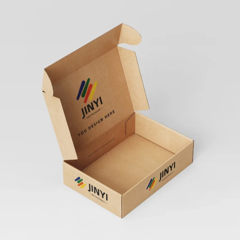
Your box can look perfect on screen, then arrive dull, scuffed, or crushed. That gap is where brands lose trust.
The “best” paperboard is not a preference. It is a risk match between your product, your channel, and the surface you can actually deliver at scale. I choose SBS, kraft, or CCNB by locking protection, readability, and consistency first.
I do not treat board names as performance guarantees. I treat them as starting points. Then I confirm coatings, durability, and how the box will behave after shipping and handling.
Why does “best paperboard” depend on risk, not preference?
Many teams pick paperboard based on mood boards. Then the first production run teaches them what “real” means.
In the U.S. and EU, shipping, shelf handling, returns, and public reviews amplify small weaknesses. That is why I lock product fragility, channel intensity, brand positioning, and lead time before I pick a board.

I see the same pattern again and again. A premium design gets placed on a board that cannot hold the finish. A cost-driven board gets paired with a soft-touch laminate that scuffs fast. A beautiful matte look gets used for tiny text and becomes unreadable under store lighting. “Best” is not what looks good in a flat mockup. “Best” is what protects the product, stays readable, and repeats consistently across batches. My order is simple: protection and structure stability first, then print clarity and consistency, then durability and experience, and only then visual effects.
The four inputs that decide “best” fast
| Input |
What it controls |
What fails if ignored |
| Product weight & fragility |
Board strength and structure |
Crush, corner burst, loose fit |
| Channel stress (e-com vs retail) |
Scuff and compression tolerance |
Worn look, returns, complaints |
| Brand positioning |
Color, feel, “premium cues” |
Mismatch between promise and reality |
| Budget & lead time |
What finishes are realistic |
Late changes and reprints |
What are SBS, kraft, and CCNB, in plain terms?
These names sound simple, but they hide trade-offs.
SBS is the clean premium print board, kraft is the natural-texture board, and CCNB is the cost-smart retail board. None of them is automatically “good” or “bad” for your product.
SBS typically gives a bright, smooth surface that prints cleanly and consistently. Kraft delivers a natural look and strong “earthy” cues, with a texture that many Western brands love. CCNB or duplex board is a value option for mass retail, often with a coated face and a grey-ish core. The most common mistake is to treat the board name like a performance label. I never do that. I still check surface uniformity, fold behavior, and how coatings will interact with the print and the handling route.
My quick definition table
| Board |
What it is |
What it is best at |
Typical limit |
| SBS |
High-white paperboard |
Clean color and sharp detail |
Higher cost; may not fit “natural” tone |
| Kraft |
Brown/natural base |
Texture and brand story cues |
Muted color and harder small-text readability |
| CCNB / Duplex |
Coated face with a lower-cost core |
Value and supply stability |
Premium finishes expose the ceiling |
When should I choose SBS for my box?
If your brand depends on clean color and fine detail, SBS is hard to beat.
I choose SBS when the box must look controlled and consistent under retail lighting and in photos. It fits beauty, supplements, fragrance, and gift-style food packaging.
SBS gives me a reliable surface for sharp typography, smooth gradients, and accurate brand colors. That matters in categories where consumers judge quality instantly. A clean board also supports finishes like matte lamination, foil, and spot UV without showing too many surface flaws. The trade-off is cost, and sometimes brand tone. If a brand wants a raw, earthy look, SBS can feel “too clean.” In that case, I either push design choices that add warmth, or I consider kraft if the product risks allow it. In real-world use, SBS tends to photograph well, and it performs predictably in consistent mass production. That is why I call SBS “more controllable,” not automatically “more premium.”
SBS is the right fit when you need
| Need |
Why SBS helps |
What I still check |
| Clean whites and bright colors |
High whiteness supports accurate ink |
Color targets and proof under real light |
| Sharp details |
Smooth surface prints fine lines well |
Small text around folds and glue seams |
| Consistent premium feel |
Stable surface for coatings |
Scuff resistance by channel |
When does kraft paperboard win, and when does it hurt?
Kraft can sell the story before the customer reads a single word. That is its power.
I use kraft when natural texture is part of the brand promise. I avoid kraft when readability, color precision, and high contrast are critical.
Kraft works well for organic food, outdoor brands, handmade products, and minimal packaging. The surface itself communicates “natural.” The risk is that many designs look muddy if they do not control contrast and hierarchy. Small text becomes harder to read, and deep colors can look dull. Batch variation can also become more visible. In e-commerce, kraft sometimes photographs flatter than SBS, especially under mixed lighting. That does not mean kraft is bad. It means kraft requires disciplined design. If a brand wants kraft aesthetics, I plan for readable typography, controlled color palettes, and I often use selective treatments like white ink, local gloss, or a clear coating strategy to lift key information without losing the natural look.
Kraft works best when you control these variables
| Risk |
What causes it |
My control |
| “Dirty” look |
Low contrast design |
Stronger hierarchy and negative space |
| Unreadable small text |
Texture + darker base |
Font sizing and high-contrast zones |
| Color variation |
Natural base fluctuation |
Limit critical colors; proof across batches |
Why is CCNB a smart retail choice, and what is its ceiling?
CCNB can be the right decision when the business model needs value and scale.
I choose CCNB for mass retail and promo packaging where cost and supply stability matter most. I do not force it into “ultra premium” expectations.
CCNB or duplex board is common for everyday FMCG and high-volume packaging. It can look clean and professional when designed for its strengths. The ceiling shows up when brands chase very delicate premium effects, especially soft touch and deep matte looks that demand a perfect surface. CCNB can also reveal surface irregularities more under certain coatings. I manage this by keeping finishing choices practical, controlling ink coverage, and making sure the structure is strong enough for the product weight. CCNB is not a “cheap” choice by default. It is a “cost-smart” choice with clear boundaries. If a brand understands those boundaries, CCNB can perform extremely well.
CCNB is a good fit when you need
| Goal |
Why CCNB fits |
What I avoid |
| Cost control at volume |
Stable supply and pricing |
Over-finishing stacks |
| Fast retail replenishment |
Manufacturing familiarity |
Ultra delicate soft-touch expectations |
| Practical durability |
Works with protective coatings |
Fine foil lines on high-wear zones |
Which coatings should I use (AQ, UV, lamination: matte/gloss/soft touch)?
Coatings are not just “effects.” They are surface delivery tools.
I use coatings to protect print, control glare, and manage scuffing. Matte, gloss, and soft touch each solve a different real-world problem.
AQ and UV coatings can protect the surface and improve rub resistance. Lamination adds a stronger layer and can change feel dramatically. Matte reduces glare and often reads more premium, but it can lower saturation. Gloss boosts color and contrast, but glare can hurt readability under bright retail lights. Soft touch creates a premium tactile cue, but it demands durability planning. Many brands only talk about the “look.” I talk about scuff, fingerprints, and how the coating behaves after shipping and shelf handling. I also consider production yield because complex coating stacks can increase defects and lead time.
Matte vs gloss vs soft touch: practical selection
| Finish |
Best for |
Real-world risk |
My control |
| Matte |
Premium readability |
Color dulling |
Design color control + proofing |
| Gloss |
High saturation impact |
Glare and fingerprints |
Gloss zoning and copy placement |
| Soft touch |
Premium tactile cue |
Scuff and fingerprints |
Durability tests + coating system choice |
How do coatings change print and color in real life?
Many “color problems” are not ink problems. They are surface problems.
Matte can reduce vibrancy, gloss can increase glare, and soft touch can show scuffs and fingerprints. I always validate readability and rub resistance under real lighting.
Coatings change how light hits the surface. Matte disperses light, so colors can look softer. Gloss reflects light, so colors pop, but text can become harder to read at certain angles. Soft touch adds a tactile layer, but it can show scuffing and fingerprints if the coating system is not chosen carefully. Registration also matters. Spot UV and foil require realistic tolerances, and they can drift in mass production if the artwork is too tight. That is why I do not approve a box only by viewing a sample in one room. I check it under retail-like lighting and I simulate handling. If a finish looks good on day one but looks worn after two days of touch, it is not a good main finish for many U.S. and EU channels.
My sample validation checklist for coatings
| Check |
What I test |
Why it matters |
| Readability under light |
Bright and warm lighting |
Stops glare and low-contrast failures |
| Scuff resistance |
Rub and edge wear |
Protects shelf appearance |
| Color shift |
Before/after coating |
Prevents surprises after finishing |
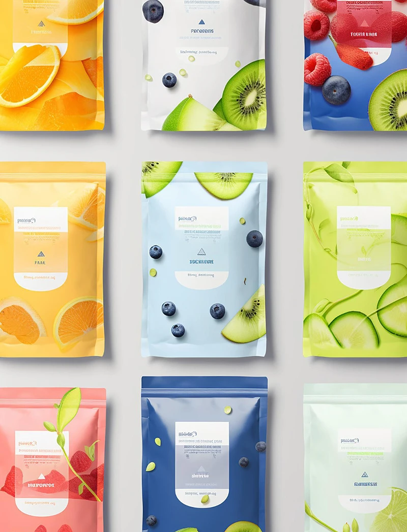
Which board and coating combination fits real product categories?
Product categories do not buy materials. They buy outcomes.
I match board and coating to what the buyer notices and what the channel punishes. The same board can succeed in one category and fail in another.
Beauty and fragrance usually need controlled color and clean detail, so SBS with matte or soft touch plus focal effects like spot UV or foil often works well. Organic foods and handmade goods often prefer kraft because the natural surface communicates the brand story, but I still manage readability with controlled color and selective contrast. Supplements and regulated categories need clear text and stable barcode zones, so SBS often becomes the safer choice. Mass retail and promo packaging often choose CCNB with practical protective coatings to control cost and maintain durability. For electronics and fragile products, structure and inserts often matter more than board name. I do not let a board decision replace a protection design.
Use-case shortcuts I use
| Category |
Typical best-fit direction |
Main reason |
| Beauty / Fragrance |
SBS + matte/soft touch + focal effects |
Control + premium cues |
| Organic / Handmade |
Kraft + controlled contrast |
Brand story and texture |
| Mass retail / Promo |
CCNB + practical protective coating |
Cost and durability |
How do I choose fast without guessing?
Brands waste time when they try to compare everything. I narrow the decision fast.
I use three inputs: brand tone × channel intensity × budget/lead time. Then I provide 2–3 board and coating combinations with clear trade-offs and limits.
I keep decisions practical. I propose a baseline option that is safe and scalable, an upgrade option that improves shelf impact, and a premium option that focuses on touch and focal effects. I also write the risks clearly. I tell the brand what effects may not be realistic on a certain board, where scuff risk will show up, and what tolerances must be respected. This removes surprises. It also reduces rework because the design team can work inside real manufacturing limits from the beginning. In developed markets, speed matters, but stable quality matters more. I prefer one correct run over three rounds of fixes.
My 2–3 option deliverable format
| Option |
Board + coating |
Best for |
Limit |
| Baseline |
Practical board + protective coating |
Stable production |
Less “wow” effects |
| Upgrade |
Better surface + controlled finish |
Shelf impact |
Needs stricter QC |
| Premium |
SBS + tactile/focal effects |
Unboxing and branding |
Higher cost and tolerance limits |
What are the most common mistakes with paperboard and coatings?
Most failures are not dramatic. They are predictable.
The biggest mistakes are over-finishing, choosing the wrong board for product weight, and ignoring barcode and glue zones. I fix them by prioritizing protection and readability first.
Over-finishing can reduce yield, increase color variation, and extend lead time. A board that is too thin or a structure that does not match weight can cause collapse, corner burst, and glue failure. Barcode zones placed on folds, glue seams, or high-glare areas create real scanning problems. These are not “design opinions.” They are real production realities that show up after launch. My correction is simple: first secure protection and readability. Then upgrade visual effects with discipline. If a finish makes the box look worse after two days of handling, I do not use it as the main finish for U.S. or EU channels.
My correction rules
| Mistake |
What happens |
My fix |
| Too many effects |
Lower yield and longer lead time |
One focal effect + controlled zones |
| Wrong board for weight |
Crush and burst |
Upgrade board or redesign structure |
| Ignored barcode zones |
Scan fails and reprints |
Lock zones early in dieline stage |
Conclusion
The best board is the one that matches risk and repeats at scale. I start with protection and readability, then I choose SBS, kraft, or CCNB with coatings that stay consistent in real handling.
FAQ
- Is SBS always better than kraft or CCNB?
SBS is more controllable for color and detail, but “better” depends on brand tone, channel stress, and budget.
- Why does kraft sometimes look “dirty” or hard to read?
The natural base reduces contrast. If hierarchy and color are not controlled, small text and deep tones can lose clarity.
- Can CCNB look premium?
CCNB can look clean and durable, but it has a ceiling with very delicate premium finishes like heavy matte and soft touch.
- Which finish is safer for retail readability, matte or gloss?
Matte is usually safer for readability, while gloss boosts color but can add glare under bright store lighting.
- What should I validate in sampling before mass production?
I validate readability under real light, scuff resistance, and any color shift after coating, plus barcode zone reliability.