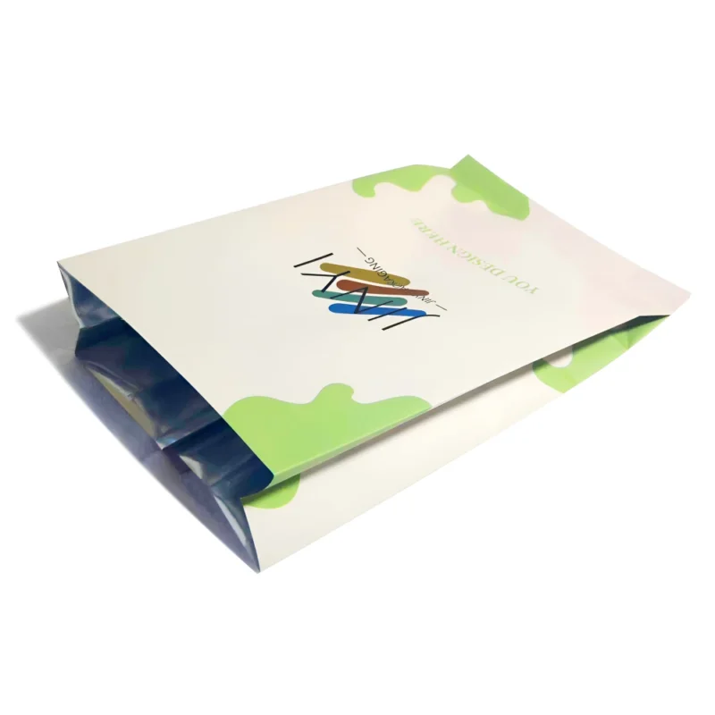
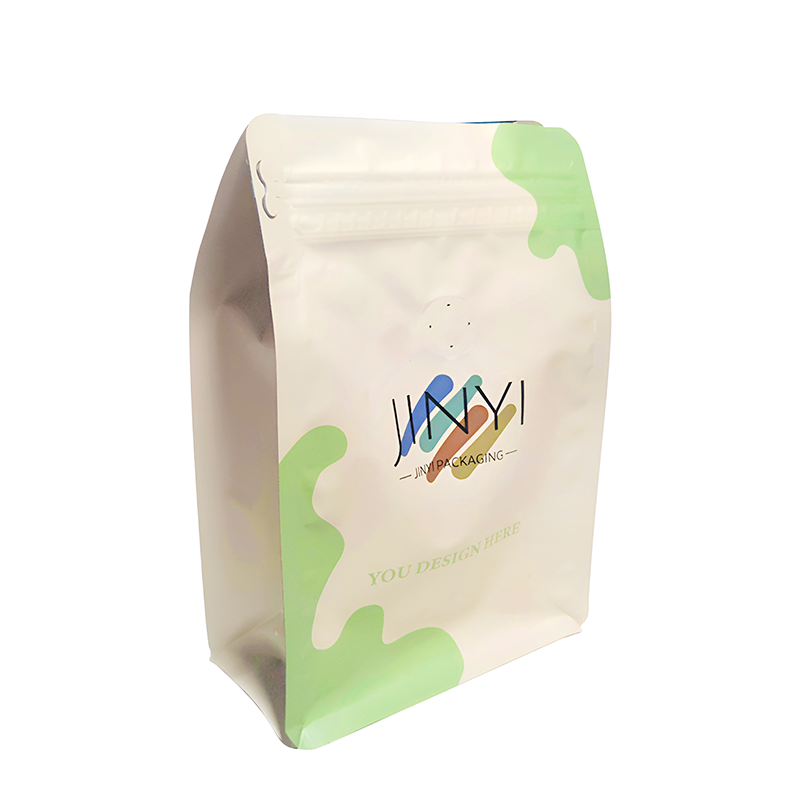
A coffee bag can look perfect in a mockup, then feel cheap in real life. That gap creates doubt, and doubt kills repeat purchase.
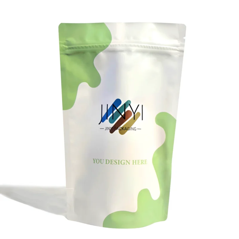
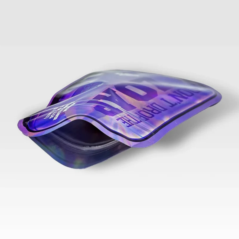
Finish effects on coffee bags are surface treatments like matte, gloss, soft touch, and foil. I use them to control glare, color punch, tactile feel, and visual hierarchy. The best finish is the one that stays readable, consistent, and durable in your real selling channel.
I treat finish selection as a practical packaging decision, not a decoration choice. I start from the shelf, the camera, and the customer’s hand. Then I pick the few effects that help the brand get understood in three seconds.
Why Do Finish Effects Matter on Coffee Bags?
Many coffee brands invest in design, then lose impact because the finish fights the environment. A coffee bag sits under harsh retail lights, gets handled by shoppers, and gets photographed for e-commerce. Those conditions amplify every weakness: glare hides text, scuffs ruin premium feel, and color shifts break brand consistency. I see this problem often because the same artwork can feel “high-end” on screen but “average” after lamination and handling.
I also see brands over-stack effects because they want to differentiate fast. Still, coffee is a trust product. If the bag looks busy, customers assume the brand is trying too hard. I prefer a finish plan that makes the message simple: who the coffee is for, what it tastes like, and why it is worth the price. For me, the finish is a tool to build hierarchy and confidence.
Finish should serve a purpose
| Finish goal |
What the customer notices |
What I prioritize |
| Readability |
“I can read it fast” |
Low glare + clear contrast |
| Premium feel |
“This feels expensive” |
Stable texture + clean surfaces |
| Brand focus |
“I know where to look first” |
One hero element + one accent |
When Does Matte Finish Look Premium, and When Does It Look Flat?
Matte finish often looks restrained and premium. I like matte for specialty coffee because it reduces glare and supports a calm, confident tone. It also helps customers read origin details and tasting notes under strong lighting. Matte can communicate craft, especially when the layout has space and the typography is disciplined. In e-commerce, matte is also easier to photograph because it avoids harsh reflections that hide text.
Still, matte is not automatically premium. Matte can make colors look muted, especially on dark designs. If the artwork relies on shine to create depth, matte can flatten the whole panel. I also watch for scuff visibility. Some matte surfaces show rubbing marks or “whitening” after handling. When that happens, the bag looks old even if the coffee is new. That is why I treat matte as a system choice: film surface, ink density, and design contrast must match.
How I decide if matte is safe
| What matte does well |
What matte can harm |
My practical adjustment |
| Reduces glare for readability |
Dark colors can feel dull |
I increase typographic contrast and spacing |
| Looks calm and craft-focused |
Design can look “flat” |
I add one controlled highlight zone |
| Photographs cleanly |
Scuffs can show |
I select a more scuff-resistant matte surface |
Why Is Gloss Finish Still a Strong Choice for Retail Visibility?
Gloss finish is still powerful because it increases saturation and contrast. When a coffee bag competes in a busy aisle, gloss can grab attention from a distance. I often see gloss work well for bold color systems, strong graphics, and mainstream positioning. Gloss can also make images and gradients look sharper, which helps brands that rely on visual flavor cues.
The trade-off is reflection. Under strong lights, gloss can hide small text and reduce readability. Gloss can also show fingerprints and scratches more clearly, depending on the film and handling conditions. Some premium brands also feel that full gloss looks too “loud” for a craft story. When I use gloss, I try to keep the front panel simple, with fewer tiny details. I also check how the bag looks under real store lighting and how it photographs for online listings.
Where gloss wins, and where it risks trust
| Gloss advantage |
Gloss risk |
What I do |
| High shelf pop and strong color |
Glare hides key text |
I protect key text with higher contrast and spacing |
| Clean, sharp graphics |
Fingerprints and scuffs show |
I choose a more resistant film surface where possible |
| Great for energetic branding |
Can feel less “craft” |
I control gloss with design restraint or mixed finishes |
Is Soft Touch Finish Worth It for Coffee Bags?
Soft touch finish creates a premium signal the moment someone picks up the bag. I like soft touch for high-price whole bean coffee, gift sets, and subscription brands that want an “in-hand” experience. Soft touch can make a simple layout feel expensive without adding visual noise. It also pairs well with small accents, because tactile contrast makes the bag feel intentional. Many shoppers cannot explain why it feels premium, but they feel it instantly.
At the same time, soft touch is the finish that exposes production and handling issues the fastest. Some soft touch surfaces show scuffing, rub marks, or fingerprints. If the bag goes through heavy shipping, those marks can appear before the customer opens it. That outcome destroys the premium story. For me, the soft touch decision is never only about “feel.” It is about durability, consistency, and how stable the finish looks across batches and SKUs.
Soft touch needs validation, not hype
| Soft touch benefit |
Soft touch risk |
What I validate |
| Premium “in-hand” experience |
Scuffing or whitening |
Rub and handling checks under real conditions |
| Works with minimal design |
Fingerprints show |
Surface choice and storage assumptions |
| Strong contrast with accents |
Batch inconsistency |
Sample-to-production matching and QC checkpoints |
How Can I Use Foil Effects Without Overdoing It?
Foil is best when it acts like an anchor, not a decoration layer. I use hot foil or cold foil to highlight the brand name, a series badge, the origin, or one flavor keyword. A small foil element can turn a simple bag into a premium bag because it creates a controlled focal point. When foil spreads across too much area, the design often feels noisy and less believable. Customers may even read it as “trying to look expensive,” which can reduce trust.
Foil also adds production complexity. Foil requires clean artwork, realistic line thickness, and good registration. If the design uses thin lines or tiny type, foil can look rough, and the premium intent becomes the opposite. I also consider channel. If the bag sits under strong light, foil can create glare that hides text. That is why I keep foil purposeful and limited, especially on information-heavy fronts.
Foil works when it supports hierarchy
| Foil use |
When it works |
When it fails |
| Logo / badge |
One strong focal point |
Too many foiled elements compete |
| Origin highlight |
Clear storytelling hierarchy |
Text is too small or too thin |
| Limited edition marker |
Collectible feel fits positioning |
Glare harms readability in-store |
How Do I Choose the Right Finish by Channel and Brand Positioning?
I choose finishes based on where the customer meets the coffee bag. E-commerce is camera-first, retail is distance-first, and subscription is unboxing-first. That difference changes everything. If the bag sells mainly online, I value controlled reflection and clean readability. If the bag sells mainly on shelf, I value visibility and contrast. If the bag sells as a gift, I value tactile trust. Then I connect those needs to the brand tier. Specialty coffee usually benefits from restraint and hierarchy. Mass coffee often benefits from bold contrast and quicker recognition.
My decision order is always the same: readability, consistency, durability, and then visual effect. If a finish looks beautiful but fails in handling, I do not let it be the main finish. I also check if the finish strategy stays coherent across the full product line. A brand can use both matte and gloss, but the logic must be clear, or the shelf presence becomes fragmented.
Channel-driven finish logic
| Channel |
Main risk |
Finish direction I often use |
| E-commerce |
Glare and readability in photos |
Matte or controlled contrast |
| Retail shelf |
Low visibility from distance |
Gloss or mixed finishes |
| Subscription / gift |
Weak in-hand premium signal |
Soft touch + small anchor |
What Production Pitfalls Should I Watch for With Finishes?
Finish effects fail more often in production than in design. Matte and soft touch can show rub marks, whitening, and scuffing. Foil can show registration issues, jagged edges, or weak detail if the artwork is too fine. Even when the finish looks correct, color can shift across different film surfaces or batches. If the brand expects the same “premium black” across SKUs, these shifts can break the identity quickly.
I reduce these risks with sampling and clear acceptance standards. I want to confirm hand feel, reflection under real light, color match, and scuff behavior before mass production. I also want consistency checks across batches. If a finish cannot remain stable at scale, it becomes a liability. For me, the goal is not “the most impressive finish.” The goal is “the most reliable premium finish.”
My common checklist before scaling
| Pitfall |
What it looks like |
How I reduce it |
| Scuffing / whitening |
Surface looks worn before opening |
Choose stronger surface + validate rub resistance |
| Color shift |
Same art looks different by batch |
Lock specs and approve physical samples |
| Foil detail failure |
Foil looks fuzzy or broken |
Simplify lines and avoid tiny foiled text |
| Adhesion issues |
Patchy finish or peeling |
Confirm film compatibility early |
Which Finish Combinations Work Best for Coffee Brands?
I prefer combinations that create hierarchy with a clear purpose. I do not combine finishes to show skill. I combine finishes to make the bag easier to understand and more trustworthy to hold. Matte plus spot UV is one of my most reliable pairings for specialty coffee because it creates contrast without glare overload. Soft touch plus a foil anchor can create a gift-level premium feel when durability is validated. Gloss plus spot matte can separate zones and improve readability, especially when the front panel has both a strong logo and detailed information.
My rule is simple: one base finish, one accent. If everything is special, nothing is special. A finish plan should guide the eye, support the story, and survive handling. When that happens, the bag feels premium in a real customer’s hands, not only in a design presentation.
Proven pairings and why they work
| Combination |
Best for |
Why it works |
| Matte + spot UV |
Specialty coffee |
Clear hierarchy and tactile contrast |
| Soft touch + foil anchor |
Premium / gift |
Strong in-hand signal with a focused highlight |
| Gloss + spot matte zones |
Retail SKUs |
Visibility plus improved readability control |
| Matte + small foil |
Story-driven brands |
Premium anchor without visual noise |
Conclusion
I use finishes to make coffee bags readable, consistent, and durable first, then beautiful. A simple and stable finish plan usually sells better than a complex one.
FAQ
1) Is matte always the most premium finish for coffee bags?
No. Matte can look premium, but gloss can also look premium when the design and channel fit. I choose based on readability, positioning, and handling.
2) Does soft touch scratch easily?
Soft touch can show scuffs and fingerprints if the surface is not selected carefully. I validate durability before I scale production.
3) How much foil is too much on a coffee bag?
When foil stops being an anchor and becomes decoration, the bag often looks noisy. I prefer foil on logos, badges, or one key highlight.
4) Should I choose finishes differently for e-commerce and retail?
Yes. E-commerce needs camera-friendly readability. Retail needs distance visibility. The best finish can change by channel.
5) What should I confirm in sampling for finish effects?
I confirm hand feel, reflection under real light, color match, scuff resistance, and consistency across batches and SKUs.