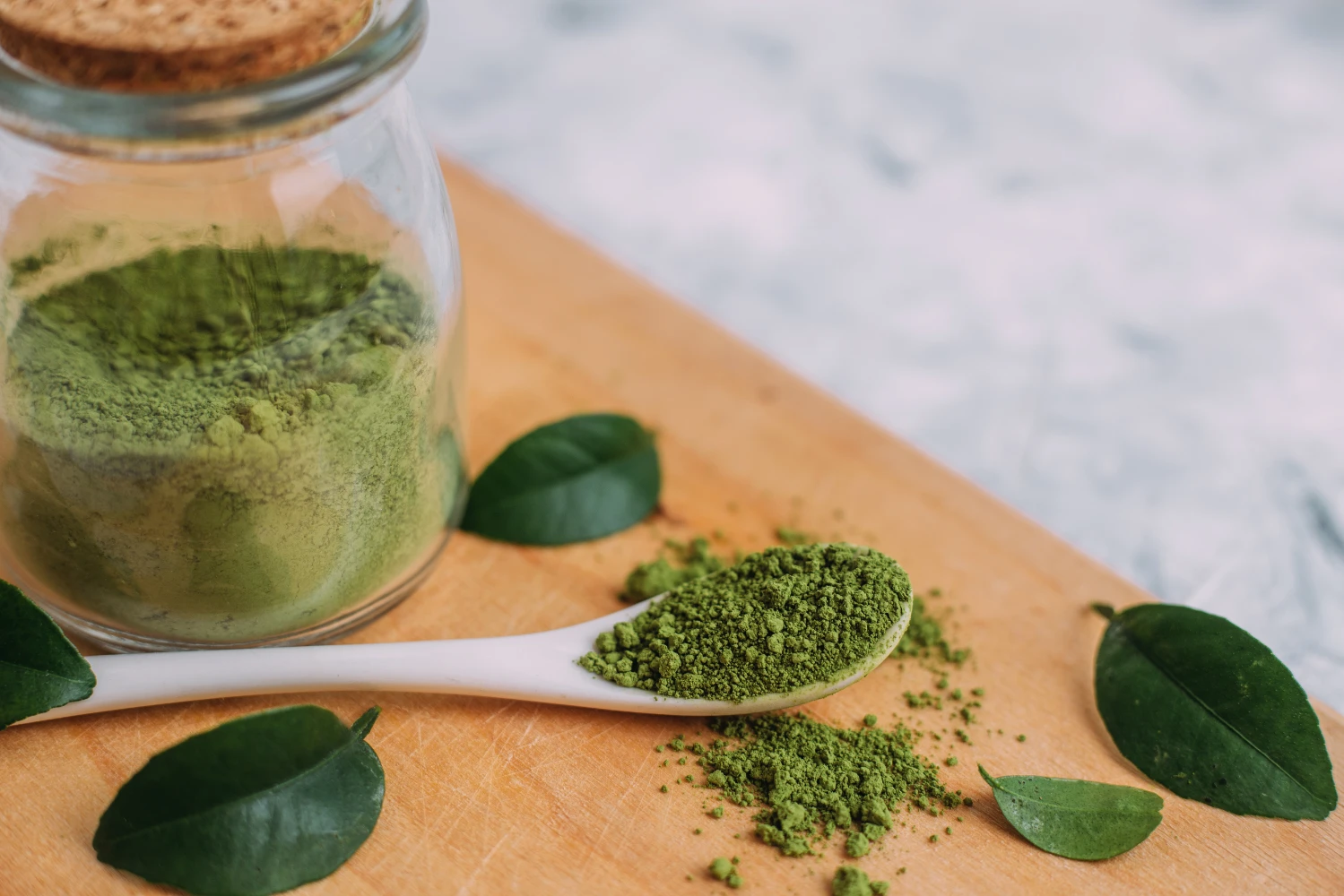
Bright green matcha looks premium fast. Many buyers stop there. That shortcut can help, but it can also hide what the product really is.
No. Bright green matcha can be a useful quality clue, but color alone cannot prove purity, sweetness level, grade, or whether the powder is right for the buyer’s real use.
Color matters because it is the first thing most buyers notice. A brighter green powder often looks fresher, cleaner, and more premium than a duller or browner powder. In many cases, that instinct is not wrong. Better matcha often does show stronger green color, and that can reflect real differences in raw material and processing. Still, a smart buying method does not stop at appearance. Buyers eventually need to ask a harder question: what can this color truly support, and what can it not prove? That is where better judgment begins. The strongest decisions come from reading color together with intended use, ingredient purity, added sugars, and the wider label context.
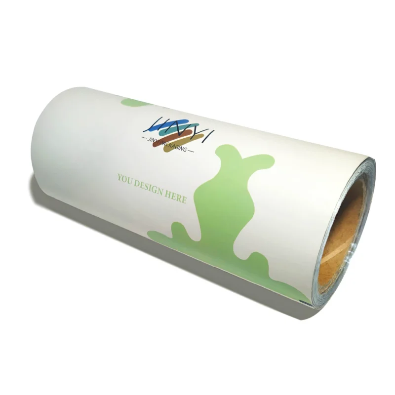
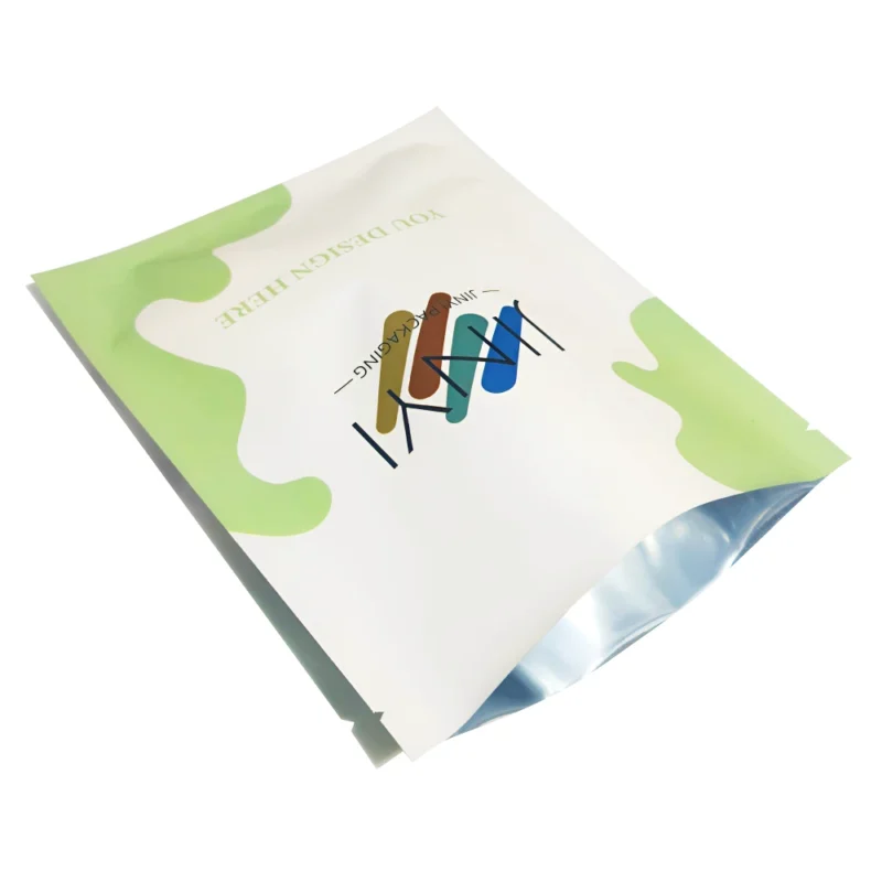
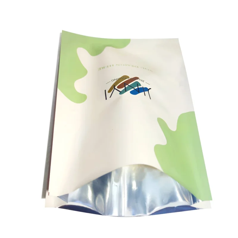
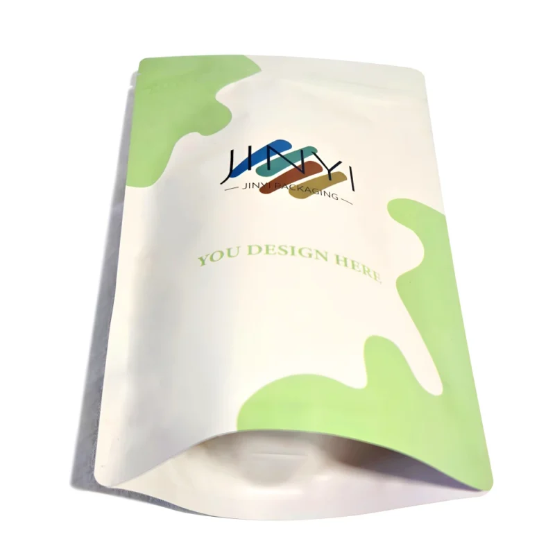
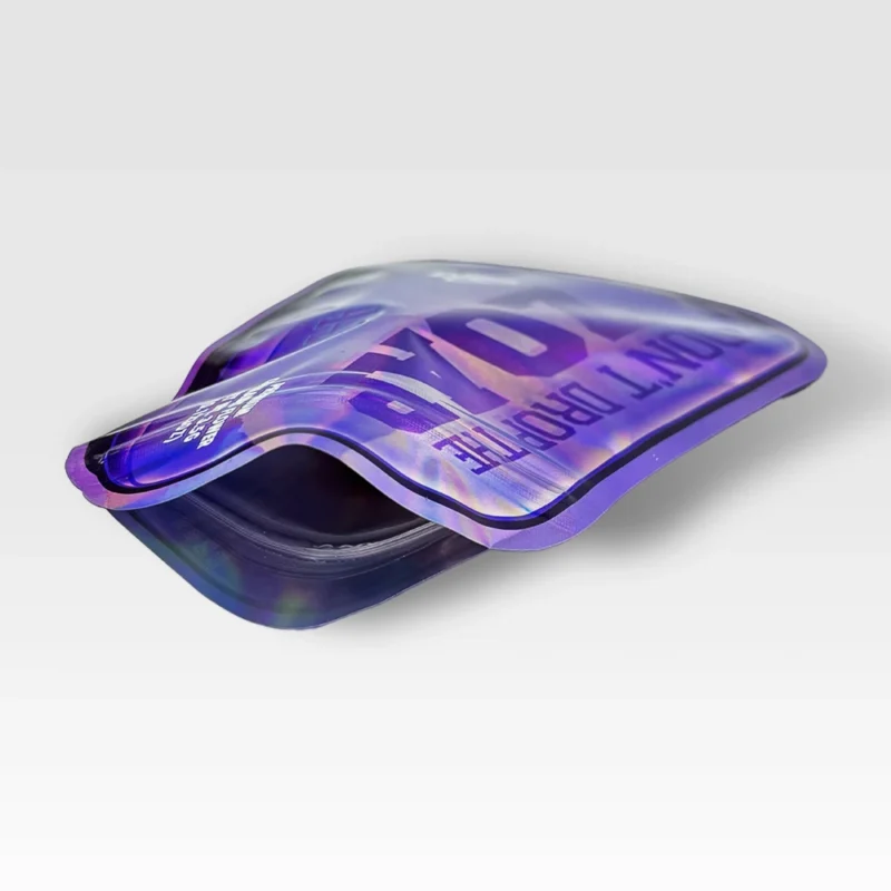
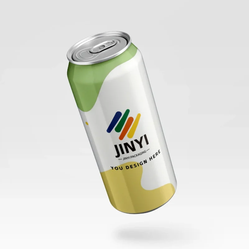
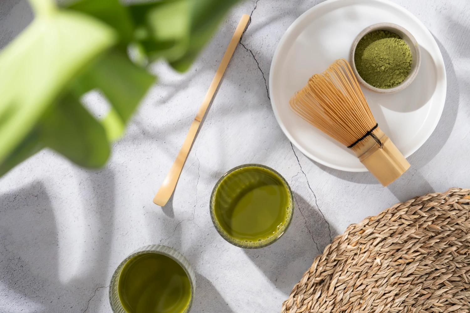
Use stand-up pouches that help matcha brands communicate freshness, color cues, and cleaner product positioning more clearly on shelf.
Why Does Better Matcha Often Look Brighter Green?
Many buyers trust color because it feels immediate. That instinct is not empty. Bright green often points to something real in the leaf and the process.
Better matcha often looks brighter green because color can reflect higher chlorophyll retention and composition patterns linked with fresher taste and more careful production.
Why green can be a real clue without becoming a magic rule
The first thing to acknowledge is that buyers are not imagining this connection. Color can carry useful information. JETRO describes higher-quality ceremonial-style matcha as more vibrant green, smoother, and less bitter. That already tells buyers that green color is not just a marketing accident. It often sits next to a broader sensory pattern. Scientific work helps explain why. A 2023 peer-reviewed study on matcha quality components reported that higher-quality matcha is characterized by higher chlorophyll, amino acids, and protein, together with lower tea polyphenols and caffeine. Those differences help explain why greener powders may also feel fresher and mellower in the cup.
The logic becomes even clearer when matcha production is considered. Shade-growing and careful leaf handling influence the composition of the final powder. The same 2023 study notes that matcha’s shading process can increase amino acids and chlorophyll while reducing some astringent components, which improves sensory quality. That means brighter green can reflect more than surface appearance. It can reflect real differences in how the leaves were grown, protected, processed, and milled.
Still, the useful conclusion is not “green equals best.” The stronger conclusion is more disciplined: color can be a meaningful quality clue because it often reflects composition and processing, not because green alone is magic. That distinction keeps buyers from turning a helpful signal into an overconfident shortcut.
| Color Observation |
What It May Reflect |
What Buyers Should Remember |
| Brighter green powder |
Better chlorophyll retention and a stronger premium-quality impression |
It is a clue, not a full buying verdict |
| Duller or yellow-green powder |
Possible lower chlorophyll retention or a different quality pattern |
It does not automatically mean the product is unusable or inappropriate for every recipe |
| Strong visual difference between powders |
Likely reflects real differences in composition and processing |
The label and intended use still need to confirm what the powder is for |
Evidence (Source + Year):
JETRO, Matcha Q&A, 2025.
Luo et al., Variations of Main Quality Components of Matcha from Different Regions in the Chinese Market, 2023.
What Can Color Actually Tell Buyers About Taste and Drinking Experience?
A greener powder often looks softer and sweeter before tasting. That visual expectation can sometimes be right, but it still needs context.
Color can sometimes suggest fresher, mellower drinking potential, but it cannot fully predict taste because preparation, milk, sugar, and recipe use also change the experience.
Why color can hint at the cup, but not settle the cup
Many buyers want color to answer a taste question. In part, that makes sense. The 2023 matcha study links higher-quality matcha with higher amino acids and lower tea polyphenols and caffeine, and it connects those features with a fresher and more mellow taste profile. JETRO’s consumer-facing guidance aligns with that pattern by describing higher-quality ceremonial-style matcha as smoother and less bitter than lower-grade culinary matcha. Put simply, brighter green often travels with a taste profile that is easier to drink plain. That is why color can help buyers who mainly want matcha for whisking with water or for very lightly sweetened preparation.
Still, color does not predict every drinking result equally well. Taste is not created by leaf composition alone. It also changes with how much powder is used, how it is whisked, whether water temperature is controlled, whether milk is added, whether sugar is added, and whether the powder is being used in a latte, smoothie, dessert, or baked product. A matcha that is not the softest direct-drinking option may still perform well in a milk-based application because stronger flavor can remain visible after dilution and sweetening.
This is why the most disciplined reading is not “green means better taste.” It is “green may suggest better straight-drinking potential, but buyers still need to match the sensory signal to the actual recipe or drinking goal.” That keeps color useful without letting it become simplistic.
| Buyer Goal |
How Color May Help |
Why It Still Is Not Enough |
| Straight drinking |
Greener powder may suggest smoother, fresher cup potential |
Preparation method still affects bitterness and texture |
| Latte or smoothie |
Color still matters visually and can imply quality |
Milk, sugar, and dilution can change what flavor profile works best |
| Dessert or baking |
Greener powder may improve final color appearance |
Recipe heat, sweetness, and cost often matter as much as raw drinking smoothness |
Evidence (Source + Year):
JETRO, Matcha Q&A, 2025.
Luo et al., Variations of Main Quality Components of Matcha from Different Regions in the Chinese Market, 2023.
What Can Color Not Prove on Its Own?
Color feels honest because it is visible. That can make it dangerous. Buyers may let a strong first impression do work it cannot really do.
Color cannot prove purity, sweetness level, formal grade meaning, or exact product identity. It may suggest quality, but it cannot settle what the powder really is.
Why a visual cue should not be mistaken for full proof
This is the boundary that matters most. A brighter powder can suggest something good, but it cannot tell buyers everything they usually want to know. It cannot tell them whether the product is pure matcha or a flavored blend. It cannot tell them whether sugar or creamer is present in meaningful amounts. It cannot tell them whether the product’s “ceremonial” wording is being used in a disciplined way or simply as strong sales language. It cannot tell them whether the powder will still fit the buyer’s real use once milk, syrup, or baking heat enters the picture.
Research on the U.S. powdered green tea market shows why this caution matters. Horie’s JARQ paper found large chemical differences among products sold as matcha in the United States and argued that a clearer definition of matcha is needed to reduce confusion. That means buyers can encounter powders that look attractive, are marketed with premium language, and yet still vary widely in composition and category clarity. In other words, market language and visual cues can be stronger than the underlying definition discipline.
FDA’s label-claim framework makes the same general lesson clearer from another angle. FDA defines structured categories such as health claims, nutrient content claims, and structure/function claims. Visual color impressions and informal grade-style marketing words are not the same as these tightly defined label categories. So even when color is helpful, it still sits outside the kind of direct, threshold-based claim structure many buyers subconsciously expect. That is why color should be treated as an opening signal, not as final proof.
| What Color May Suggest |
What It Still Cannot Prove |
Why Buyers Need More |
| Potentially better leaf and process quality |
That the powder is pure matcha without mix-ins |
Purity must be confirmed on the ingredient list |
| A smoother drinking profile |
That the product is unsweetened or low in added sugars |
Sweetness must be checked on Nutrition Facts and ingredients |
| Premium visual quality |
That the product fits the buyer’s actual recipe or use |
Use case still changes what “better” means |
Evidence (Source + Year):
Horie, Comparison of the Chemical Components of Powdered Green Tea Sold in the U.S., JARQ, 2018.
Why Should Buyers Check Ingredients and Added Sugars After Looking at Color?
A bright image can create trust quickly. That is exactly why buyers need a second step. The back label often changes the whole reading.
After looking at color, buyers should check the ingredient list and added sugars. This is often where pure matcha separates from sweetened latte mixes and flavored blends.
Why the label usually tells buyers more than the powder color can
This is the point where many buying mistakes can be prevented. A product can show a vivid green visual or premium matcha photography and still be very different from what the buyer expects. FDA requires ingredients on a food label to be listed in descending order of predominance by weight. That makes the first few ingredients extremely important. If the first ingredient is matcha green tea powder, the buyer is looking at one kind of product story. If sugar, creamer, flavor systems, or other mix components appear first, the product story changes immediately. The visual impression may still be attractive, but the product is no longer best understood as simple pure matcha.
The added-sugars line on the Nutrition Facts panel gives another practical check. FDA explains that labels for foods and beverages with added sugars list both grams and percent Daily Value for added sugars. FDA also repeats a useful shortcut: 5% DV or less is low, while 20% DV or more is high. Just as important, FDA reminds consumers that added sugars are only one piece of the puzzle and that the ingredient list and full Nutrition Facts panel should be read together. For matcha buyers, this matters because a visually premium product can still be a sweetened latte mix or a flavored café-style powder rather than a plain tea powder.
So the better sequence is simple. First, let color work as a clue. Then check ingredients. Then check added sugars. Only after those steps should buyers decide whether the appealing green color actually matches the product they thought they were choosing.
| Buyer Check |
What It Clarifies |
Why It Matters After Color |
| First ingredient |
Whether matcha is the main ingredient |
It separates pure matcha from blends more clearly than appearance does |
| Added Sugars |
How sweet the formula is per serving |
A bright-looking product may still be a sweetened mix |
| Short or long ingredient list |
Whether the product is simple tea powder or a more built-out beverage base |
It helps buyers match the product to their intended use |
Evidence (Source + Year):
FDA, Types of Food Ingredients, 2023.
FDA, Added Sugars on the Nutrition Facts Label, 2026.
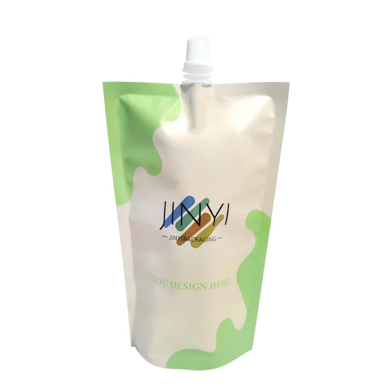
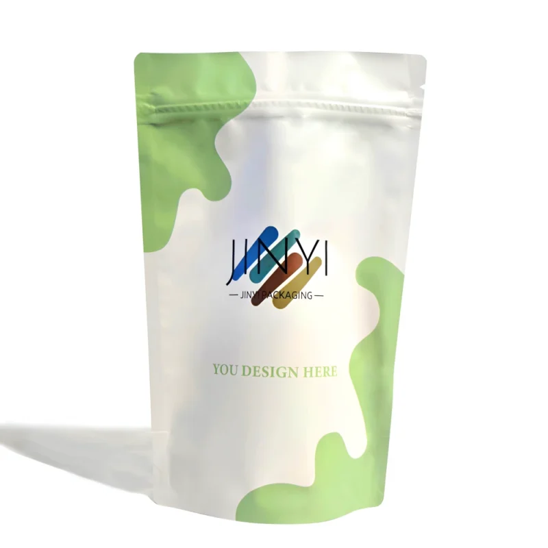
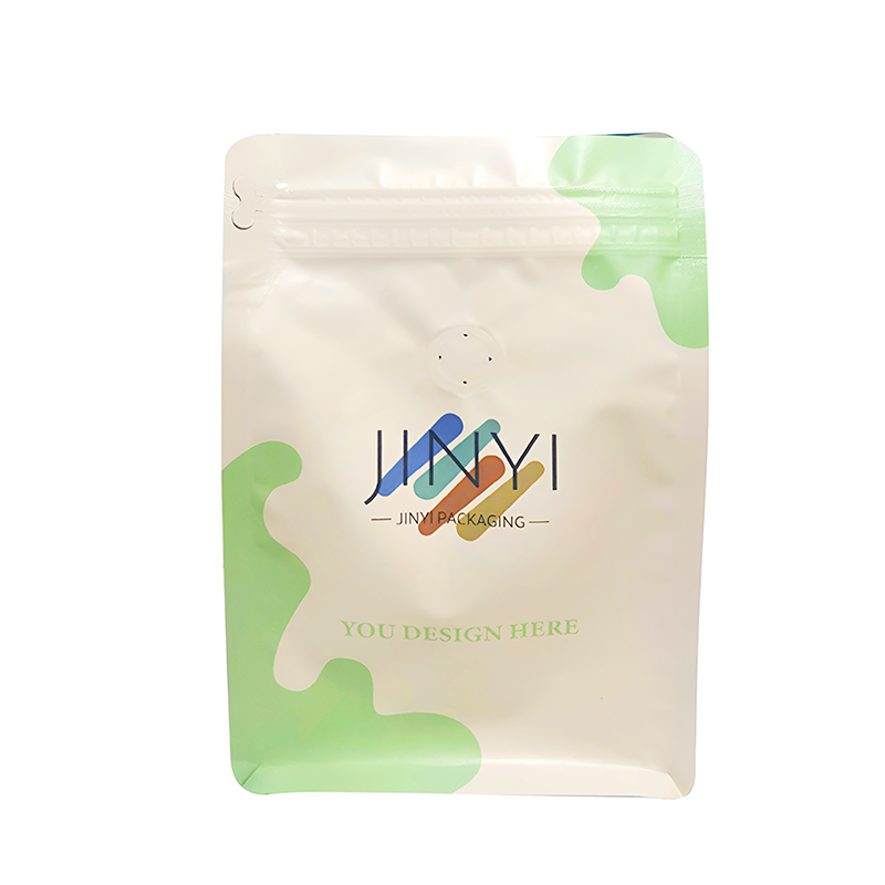
Choose stand-up pouches that help buyers distinguish pure matcha from sweetened or flavored mixes before confusion starts.
How Should Buyers Use Color in a Better Matcha Buying Framework?
Buyers do not need to ignore color. They need to place it correctly. Good judgment starts when color becomes the first step, not the only step.
The best framework uses color as an opening clue, then checks intended use, ingredient purity, added sugars, and label context before drawing a final conclusion.
How to turn color from a shortcut into a smart sequence
A strong buying framework does not throw color away. It simply gives color the right job. Step one is to look at the powder color and let it work as a quality clue. A brighter green powder may deserve closer attention because it can reflect real composition and processing differences. Step two is to identify intended use. Is the buyer choosing matcha for direct whisking, daily lattes, smoothies, desserts, or baking? That question matters because the meaning of “better” changes with the application. Step three is to read the ingredient list to see whether the product is pure matcha or a mix. Step four is to check added sugars and the rest of the Nutrition Facts panel. Step five is to return to any ceremonial, culinary, or usage language and ask whether it still fits what the product has already shown on the label.
This sequence is useful because it keeps each signal in its proper place. Color starts the judgment. The label confirms the judgment. Intended use sharpens the judgment. Together, these steps help buyers avoid two common mistakes. The first is buying by appearance alone. The second is rejecting color entirely because it is not perfect proof. Better judgment sits in the middle. Bright green can help buyers start the decision, but it should never be the final answer.
That is the more mature way to buy matcha. It is not about finding one magical sign. It is about reading several signals in the right order, with color working as the beginning of the process rather than the end.
| Step |
What the Buyer Checks |
Why It Improves the Decision |
| 1 |
Color |
It provides a first quality clue worth noticing |
| 2 |
Intended use |
It defines what “better” should mean for this purchase |
| 3 |
Ingredient list |
It confirms whether the product is pure matcha or a mix |
| 4 |
Added Sugars and Nutrition Facts |
It shows sweetness and product type more clearly than color can |
| 5 |
Grade or usage wording |
It becomes easier to judge once the harder signals are already checked |
Evidence (Source + Year):
JETRO, Matcha Q&A, 2025.
FDA, Added Sugars on the Nutrition Facts Label, 2026.
About Us
Jinyi — From Film to Finished—Done Right.
https://jinyipackage.com/
Our Mission
We believe good packaging is not only visual design. It is a solution that works reliably in real conditions. Jinyi aims to provide practical flexible packaging solutions that help brands reduce communication cost, improve quality stability, and match packaging structure and printing results to real products and sales channels.
Who We Are
Jinyi focuses on Custom Flexible Packaging and brings more than 15 years of production experience to food, snack, pet food, and many consumer goods categories. The factory is equipped with multiple gravure printing lines and HP digital printing systems, which support both stable high-volume production and flexible small-batch runs.
As a flexible packaging manufacturer, we focus on how packaging performs in transport, shelf display, and everyday consumer use. For powders such as matcha, that often means supporting cleaner barrier presentation, clearer claim hierarchy, stronger print consistency, and packaging structures that match how the product is sold and used.
FAQ
Does bright green always mean better matcha?
No. Bright green can be a helpful clue, but it cannot prove purity, sweetness level, or whether the powder is the best fit for the buyer’s intended use.
Why is high-quality matcha often greener?
Research suggests that higher-quality matcha often has higher chlorophyll and amino acid levels, which can support both greener color and a fresher, mellower profile.
What should buyers check after looking at matcha color?
They should check the ingredient list and the added-sugars line on the Nutrition Facts panel to see whether the product is pure matcha or a sweetened or flavored mix.
Can a less bright matcha still be useful?
Yes. A less bright powder may still work well for lattes, smoothies, desserts, or baking, where stronger flavor or lower cost can matter more than the softest direct-drinking profile.
Can color tell buyers whether a product is pure matcha?
No. Purity must be confirmed by reading the ingredient list, because appearance alone cannot show whether sugar, creamer, or flavor systems are present.