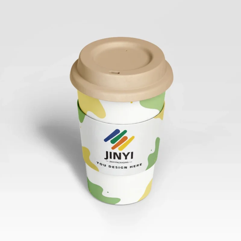
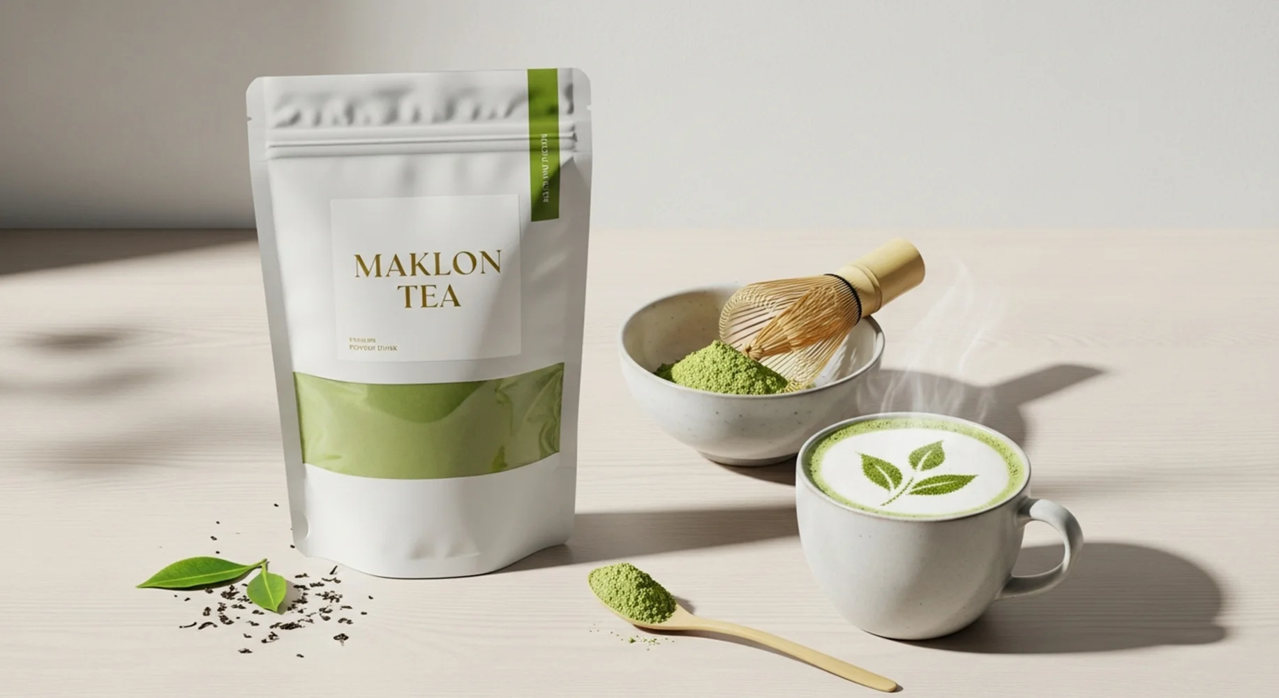
Many matcha bags look expensive. Then they lose freshness, feel awkward, or create trouble in production.
I do not judge a matcha pouch by premium appearance first. I judge it by whether the structure protects the product, runs stably, fits the route, and still works after the customer opens it.

If your matcha pouch looks premium but still feels risky, I would define the real packaging job before I judge the finish.
In my daily work, premium image is only one layer. The structure still has to protect color, hold aroma, stay clean in filling, and make daily use feel easy. That is where good-looking bags often start to separate from good-performing bags.
Why Do Buyers So Often Mistake Premium Appearance for Strong Packaging Performance?
Many buyers see matte, metallic, thick, and well-printed bags, then assume the structure must be good too.
I do not make that jump. Premium image and packaging performance are solving different problems.
Why I do not start with the first three seconds
A matcha pouch can look refined, feel thick, and photograph beautifully, yet still miss the real job. I see this mistake often because surface finish is easy to notice and structure logic is not. Matte varnish, soft-touch feel, metallic effects, and elegant color choices can all support branding. They do not automatically protect a light-sensitive powder, improve seal cleanliness, or make repeated use easier. From a production standpoint, this matters because buyers often approve samples with their eyes first and discover the limits only after filling, shipping, or opening. I never use visual polish as proof that the bag will perform well. I ask a more basic question. Does the pouch actually protect the product value under real conditions, or does it only look expensive at first glance?
| Looks premium |
Performs well? |
| Maybe |
Only if structure logic is right |
| Nice finish |
Not equal to real protection |
What Does a Matcha Powder Bag Actually Need to Do Well First?
Before I judge whether a matcha bag is good, I first ask what the bag actually needs to do well.
For me, a good-looking matcha pouch is never enough. It must first do the real packaging job well.
What I expect the bag to handle
I usually start with five tasks. First, the bag has to protect color and freshness, because matcha sells partly on how vivid and clean it feels. Second, it has to hold aroma well enough, because slow aroma loss weakens the premium feeling before obvious failure appears. Third, it has to stay clean and stable in filling. Fine powder can contaminate the seal area and expose weak tolerance fast. Fourth, it has to support repeat use if the customer will open it many times at home or in a café. Fifth, it has to fit the real sales path. E-commerce, shelf display, gift presentation, and export shipping do not ask for the same answer. In real manufacturing, this detail often determines whether a pouch performs as a packaging tool or only as a brand surface.
| Real job |
Why I check it |
| Protect color and aroma |
This protects product value |
| Fill and reclose well |
This protects real use |
Why Can a Premium-Looking Bag Still Fail in Real Use?
This is where the contrast becomes clear. A premium look does not protect a weak structure.
A premium-looking bag can still underperform because visual design and structural performance are solving different problems.
Where I usually see the gap
I usually see four failure paths. The first is weak light logic. The bag looks refined, but the product still sees more light than it should. The second is weak seal stability. The outer design is polished, but fine powder hangs in the seal zone and the real tolerance was never respected. The third is awkward daily use. The zipper sits too low, the opening feels tight, or the top area gets dirty too easily during scooping. The fourth is weak route logic. The bag was designed to look impressive on shelf, but it was not balanced for shipping pressure, storage time, or repeat handling. From our daily packaging work, we see that premium image can hide these issues during approval. Real use exposes them fast. That is why I separate appearance success from structure success very early.
| Looks good |
Still can fail by… |
| Polished sample |
Light, seal, use, or route logic |
| Luxury finish |
Weak day-to-day behavior |
If your pouch wins the shelf photo but loses on sealing, storage, or repeat use, I would review the structure before I review the artwork.
How Do Light Protection, Seal Quality, and Repeat Use Matter More Than Surface Finish?
Buyers often spend more attention on finish effects than on the variables that decide actual performance.
For matcha, surface finish can support selling, but light protection, seal quality, and repeat-use logic usually decide whether the structure truly works.
What I rank ahead of finish
I rank light protection first because matcha loses value when appearance and freshness impression start to drift. I rank seal quality next because a beautiful pouch with inconsistent sealing is still a weak pouch. Then I rank repeat use. If the customer opens the bag every day, the pouch has to stay clean enough, reclose well enough, and feel easy enough to live with. After opening, small details become more important than the first shelf impression. Does powder collect at the top? Does the zipper stay usable? Does scooping feel controlled or messy? From a production standpoint, this matters because surface finish does not rescue a bag that frustrates the user or underprotects the powder. I still respect finish, but I never let it outrank the variables that decide whether the pouch performs in the real world.
| I rank first |
I rank later |
| Light, seal, repeat use |
Matte, soft-touch, embossing |
| Structure logic |
Surface expression |
Why Do Some Premium Features Add Image but Not Real Packaging Value?
I am not against premium features. I am against premium features that add image but do not support the real packaging job.
Design should support structure, not force structure to serve the wrong surface effect.
Where I stay careful
Some premium elements create strong first impressions but add little real value. Heavy matte or tactile layers can look refined, yet they do not help if barrier and sealing were not considered at the same time. Large transparent areas may feel clean and modern, but they can conflict with matcha’s sensitivity to light. A very thick-feeling bag may project quality, but it may mostly add material presence, not smarter protection. Some complex visual builds also raise cost, slow production, and make user handling less clean without solving the real risk. In real manufacturing, this detail often determines whether the design supports the packaging system or competes against it. I still like premium features when they reinforce the right job. I just do not give them credit for performance they never actually deliver.
| Adds image |
Adds real value only if… |
| Tactile or thick feel |
Protection and use still improve |
| Large display window |
Exposure risk stays acceptable |
What Really Matters When I Choose the Final Structure for a Matcha Powder Bag?
This is where I narrow the answer. I do not choose by style first. I choose by protected value first.
When I choose a matcha pouch structure, I care far more about real protection and real use than about whether the bag only looks expensive in the first three seconds.

My final structure path
I usually work in four steps. First, I define what product value must be protected most clearly. It may be color, aroma, premium freshness, or easy daily use. Second, I identify the first likely failure. That may be light exposure, aroma drop, sealing contamination, awkward reclose, or route stress. Third, I remove features that look impressive but fight the real job. I do not keep decorative choices that complicate production or weaken actual protection. Fourth, I balance structure, production stability, appearance, and cost. From our daily packaging work, we see that the smartest pouch is rarely the one that shouts the loudest visually. It is the one that keeps the matcha feeling right, works on the line, survives the route, and still makes sense in the customer’s hand after purchase.
| Step |
What I check |
| 1 |
Protected value and first likely failure |
| 2 |
Bad-fit features, then balance |
Conclusion
A matcha bag does not perform well because it looks premium. It performs well because the structure protects real product value under real use conditions. Contact us to discuss the right pouch.
Talk to JINYI About the Right Matcha Pouch Structure
About Us
At JINYI, I work with a team focused on custom flexible packaging. Our slogan is From Film to Finished—Done Right. We believe good packaging is not only about appearance. It should work reliably in transport, on shelf, and in the consumer’s hand. JINYI focuses on custom flexible packaging with more than 15 years of production experience. Our factory runs multiple gravure lines and HP digital printing systems, so I can support both stable volume production and flexible custom work. Website: https://jinyipackage.com/
FAQ
Does a matte or soft-touch pouch automatically perform better?
No. Those finishes can support image, but they do not prove the structure protects matcha well.
Why can a premium-looking matcha bag still underperform?
Because light logic, sealing, repeat use, and route fit may still be weak behind the decoration.
What do I check before surface finish?
I check product value, first likely failure, seal behavior, route stress, and repeat-use logic.
Can premium features still be useful?
Yes. I use them when they support the real packaging job instead of distracting from it.